
In the course of my long career as a Graphic Designer I have been privileged to contribute to many interesting and enjoyable creative projects. Not many of these jobs have made me as happy as I currently feel. This is because I recently designed the cover to the new James Bond novel On His Majesty’s Secret Service, written by Charlie Higson and published this very day, 4th May 2023.
Last Autumn, in the downtime between contracts, through a simple twist of fate I somehow made the acquaintance of Ian Fleming Publications Ltd. We came to discuss the idea of working together. They were looking for a Designer with a background in branding and I seemed to fit the bill. The fact that I have been a James Bond fanatic for most of my life might have helped. I think the team at IFPL appreciated that I knew the literary 007 and understood the tonal differences between the film Bond and the book Bond.
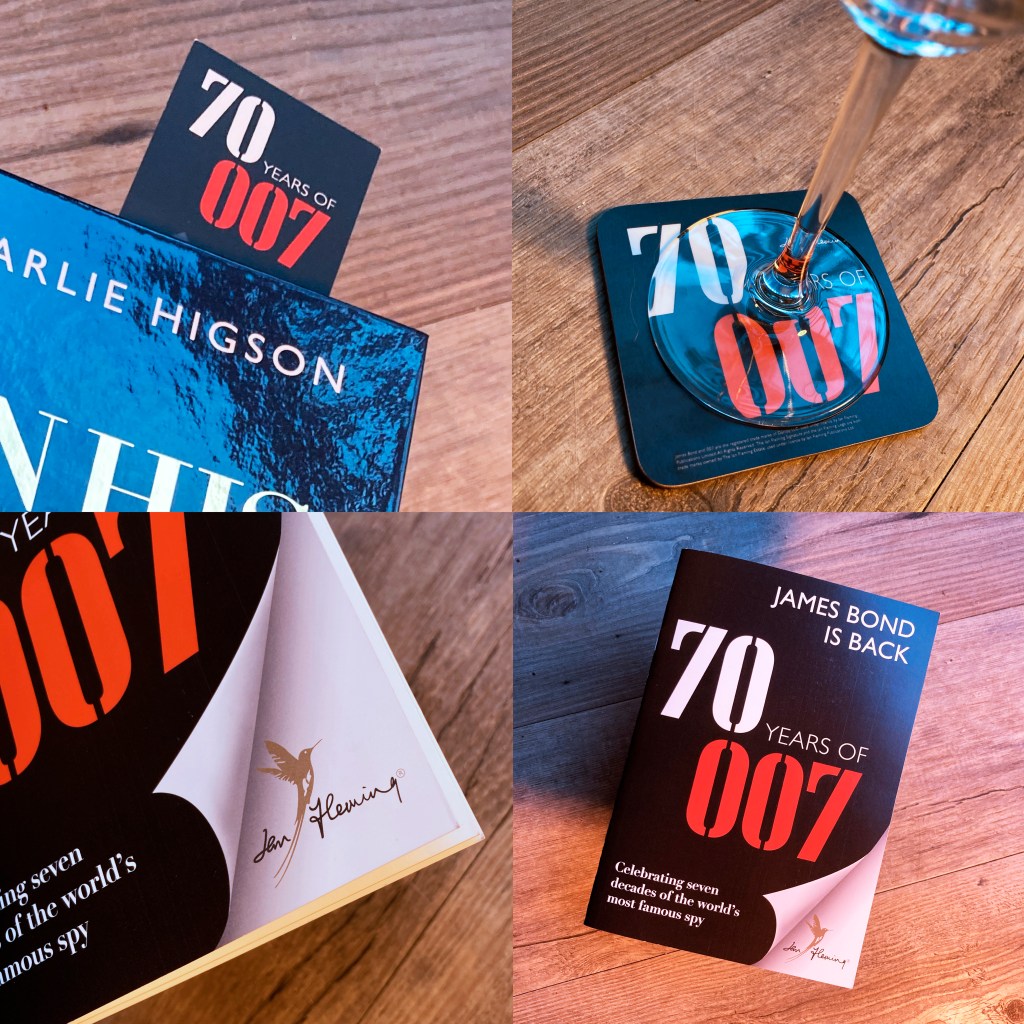
I was commissioned to create the logo and branding for the 70th anniversary of the publication of the first James Bond novel, Casino Royale. The team at Ian Fleming Publications Ltd were a joy to work for; warm, encouraging and appreciative. We landed on a logo which utilised the typeface Tea Chest which was used on the first editions of 9 of Fleming’s 14 original Bond books.
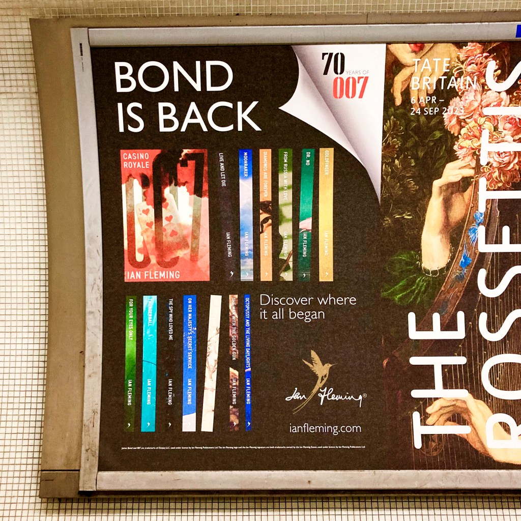
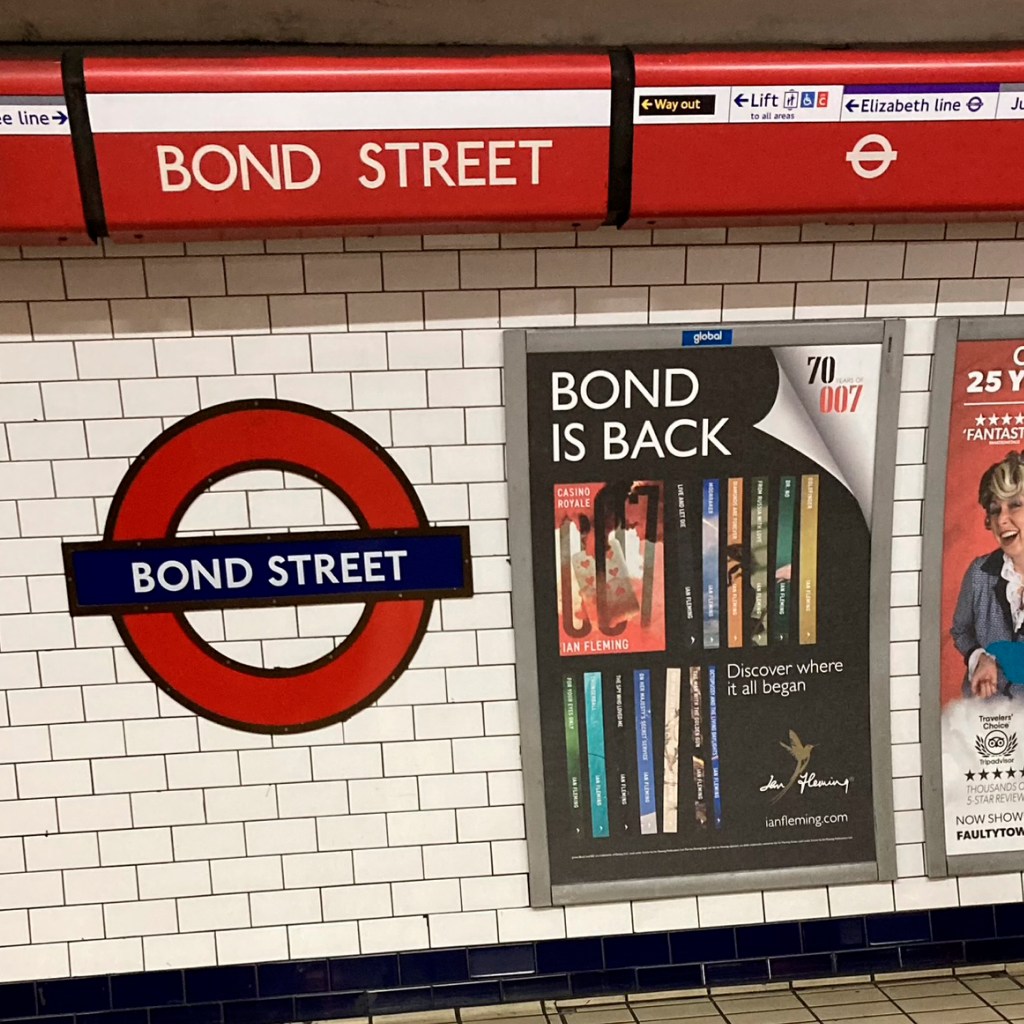
We rolled the branding out across all platforms including, bookmarks, coasters, a 32 page sampler book, press ads and posters. The latter currently adorning the tube and rail network in London. These showcase the new editions of the 14 Fleming Bonds (featuring lovely cover designs by Webb & Webb) along with the ‘70 Years of 007’ logo and a page turn device which emphasises the literary Bond.
In the spring of this year IFPL asked me to pitch ideas for the cover design of a new Bond adventure, a contemporary story set around the coronation of King Charles III.
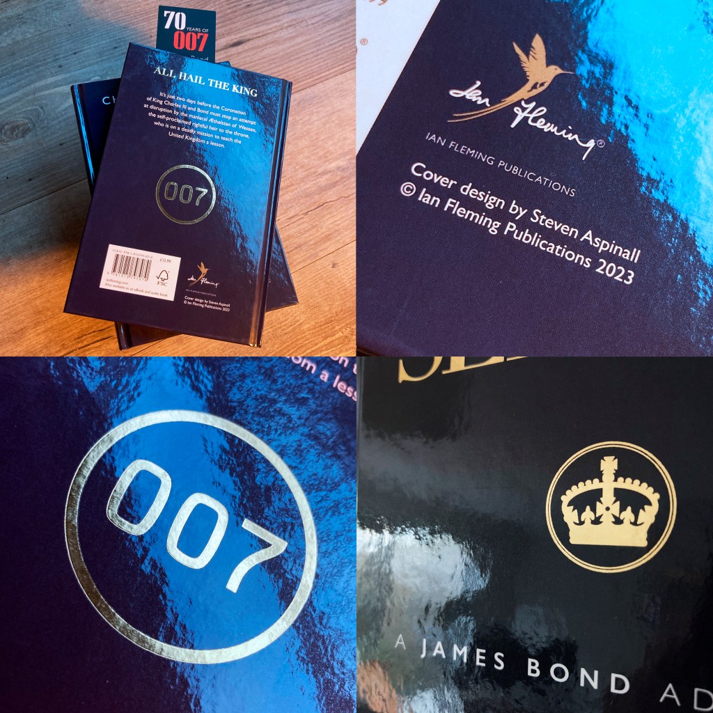
I presented 3 alternative design directions playing on the visual language of royalty – flags, crowns, etc – but looking to add a visual twist denoting danger and adventure. We discussed the ideas at length, leading to a second design phase where I introduced a minimal typographic approach.
The final design applies gold foil block to a navy blue gloss laminated board. The feeling is premium. Someone remarked it looks strong and confident, like Bond himself. And perhaps elegant and regal. Fit for a king?
