In 2019 I wrote about my enduring love for all things 007. It now seems like a good idea to celebrate Global James Bond Day by looking at the evolution of the literary Bond from a Graphic Designer’s perspective.
Taking one novel, From Russia, With Love, I have appraised the cover design of 11 different editions from 1957 until present day. There are many more versions out there but I have concentrated on the ones that I like. All the images are from my own collection.
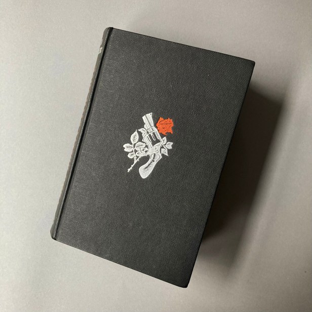
First edition hardback, Jonathan Cape, 1957
Book Club edition, 1957
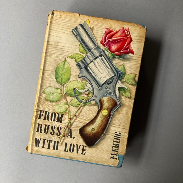
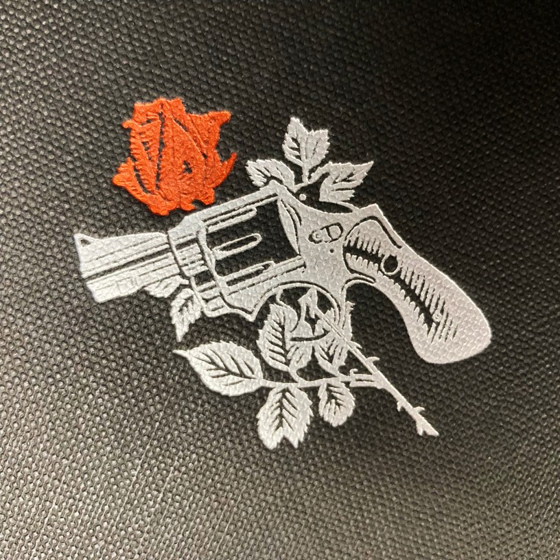
From Russia, With Love is the fifth Ian Fleming James Bond novel and the first to feature the art of Richard Chopping who went on to illustrate the covers of 9 of the 14 original Bonds. The gun and rose motif, also embossed in red and silver on the front board, was suggested by Fleming. Chopping was an established natural history illustrator. He painted in a ‘realism’ style showing attention to detail and often with a surreal edge to his composition. His work on the Bond books is never predictable or obvious. His natural history background comes through in his use of foliage, wood, bones and insects. These exotic visual textures knowingly reflect the fact that all but one of Fleming’s Bond stories take place overseas. The stencilled typeface (Tea Chest designed by Robert Harling in 1939) works in this context and was used on nearly all of Chopping’s Bond covers. The way the title treatment sits behind the stem of the rose gives the layout a sense of depth.
Much to my disappointment the dust jacket on my Jonathan Cape first edition is missing. However, Foyles used the same illustration for their Book Club edition, only this time with blue boards and without the embossing. They operated several imprints and reprinted many contemporary novels. Their Book Club was a mail order business run from 121 Charing Cross Road, London.
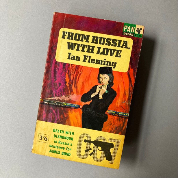
First Paperback edition, Great Pan, 1959

This could be a poster for a film about a hard-boiled detective. The look is undeniably ‘Film Noir,’ echoing the atmospheric, painted covers of the pulp novels that were popular in the 1950s. Bond is shown with Tatiana Romanova, the Russian love interest – though I’m not sure about his pink bow-tie. Also featured is The Orient Express which appears in the final third of the story. The yellow title panel was consistent across all Pan paperbacks at this time.
The illustration is by Sam Peffer, a prolific commercial artist who previously worked for Pearl & Dean and painted 100s of book covers throughout the 50s and 60s. Peffer based his likeness of Bond on actor and model Dick Orme.
Paperback, Pan, 1963
A cleaner layout picturing Tatiana in the foreground with depth provided by The Orient Express. The painterly abstract background suggests intensity and passion. From this point on, it was rare to see a direct representation of Bond on a book cover. He was more likely to be featured as a silhouette, or in this case, his code number. The lower section shows one of the first examples of ‘007’ as a stylistic graphic device and was used by Pan for some time afterwards. The Yellow title panel remains, but this time with a characterful stencil font.
The illustration is by Pat Owen, a freelance artist and Art Director who had previously worked on covers for Pan in the 1950s. Owen went on to illustrate 7 Bond covers.
Film tie-in paperback, Pan, 1963
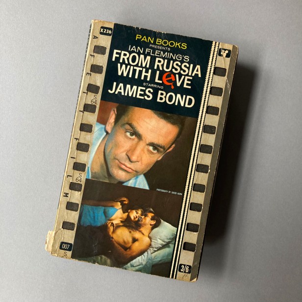
Released in the same year as cinematic From Russia, With Love this design features die-cut sprocket holes usually found in 35mm film stock. It’s a unique effect, though overall I feel this cover is too busy. A single David Hurn production still would have been enough, thus allowing more space for the typography to breathe.
Paperback, Pan, 1964
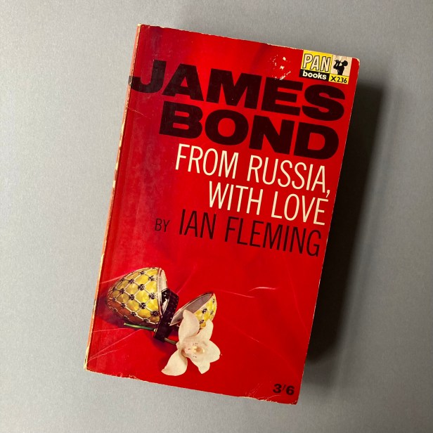
Suddenly we jump into the world of brand design. This modern layout is a giant leap from the previous approach. The visual combination of texture, pictorial device and strong typography was rolled out across the 14 Fleming Bond books, unifying the series for the first time. Positioning James Bond above the title and author’s name was a design masterstroke, copied by many publishers. I adore this concept.
When I first saw these editions aged 12 it was a lightbulb moment: The possibility of designing something that was part of a series, yet could stand alone has stayed with me throughout my career.
This is the work of Raymond Hawkey, a Royal College of Art graduate who became an eminent Graphic Designer in the 1950s. He was an Art Director for the Daily Express where he befriended Len Deighton, whose book covers he went on to create. It was Deighton’s friendship with Ian Fleming which eventually led to Hawkey winning the commission to redesign the Bond covers for Pan.
Paperback, Pan, 1973
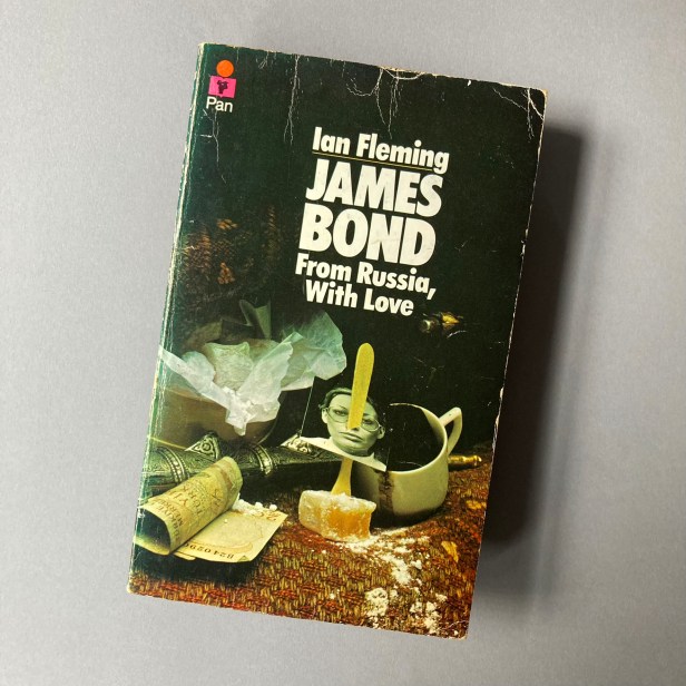
This cover Bond collectors refer to as the ‘Still Life’ series. It features a tableau of objects mentioned by Ian Fleming in the story: a woven rug, banknotes, coffee, Turkish delight and a photograph of love interest, Tatiana.
The wraparound cover image evades cliche without losing any sense of sophistication and drama. The typography is understated and classy for the time.
The designer is uncredited but it is believed to be Raymond Hawkey. The approach is likened to his work on the Len Deighton novels of the early 60s, and his title sequence for Richard Attenborough’s 1969 film, Oh! What A Lovely War. The photographer could be Adrian Flowers assisted by Brian Duffy, both close friends of Hawkey.
Paperback, Penguin USA, 2002

In a positive way, this beautiful and richly designed series of covers calls back to the illustrated Pans of the 1950s and 60s and is in keeping with the world the Bond novels are set in.
It features a scantily clad Tatiana as the main focus (she’s dressed this way when Bond first meets her in the story) and The Orient Express as a background element. Scattered cyrillic typewriter keys are deployed, alluding to the decoding device which Tatiana attempts to steal in the novel.
They were created by Penguin US Art Director Rosanne Serra, and Designer / Photographer Richie Fahey who colourises his dramatic black and white pictures with photo oil paints, applying texture to achieve the required effect.
I bought my copies on work trips to the US in 2003 and 2004 as this series wasn’t available in the UK at the time. Thankfully, someone at Penguin eventually saw sense and they were finally released here in 2006.
Penguin Modern Classics, 2004
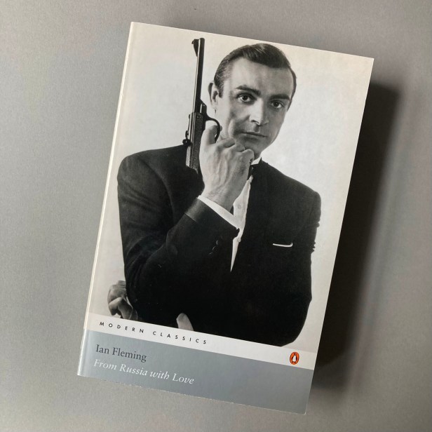
I grew up collecting Penguin Modern Classics for their design ethos, so it was a joy to witness my beloved Bond novels achieve this status.
Most of the images used in this series feature atmospheric, abstract, stock imagery. Some of the covers use a photograph of Sean Connery which could be misleading because it gives the books a movie tie-in feel, as is the case here. Despite this, it is a classic image of Connery by British Photographer David Hurn, one of his publicity shots for the 1963 film version of the novel.
Paperback, Penguin Decades, 2010

In 2010 Penguin celebrated it’s 75th anniversary by re-issuing key novels from the 1950s, 60s, 70s and 80s which they claim ‘helped shape modern Britain.’ Five books from each decade were selected, each designed by an established artist. Peter Blake took on the 1950s books including From Russia, With Love.
No surprises here from Blake whose work I normally revere. His trademark collage style and the use of a stencil typeface leaves me slightly underwhelmed. The cover appears to have been cropped too tightly.
Hardback, The Folio Society, 2016

This is high-end book design, no expense spared. In 2015 The Folio Society began publishing the Bond books, lovingly embellished by London-based artist Fay Dalton. Each edition features several of her seductive illustrations. The rich realist / retro style of Dalton’s work, the artfully crafted packaging and the tactile quality of the boards and endpapers invoke the glamourous atmosphere of the novels. Dalton rightly follows the theory that we never see Bond full on. We see him from the back, or slightly obscured, as he is here on the slipcase of From Russia, With Love taking us full circle to the look and feel of Film Noir.
Today I read that Ian Fleming Publications Ltd have announced that they will be publishing his books under their own imprint, launching brand new editions of the Bond novels in the UK and Commonwealth markets in April 2023. I can’t wait to see what the new covers look like.
More detailed information about the evolution of Bond cover art can be found at the 007 Magazine website which was a valuable resource for this piece. It’s well worth a losing a few hours over if you’re a cover art obsessive like me.
