I seem to have unwittingly assembled an excessive amount of design-related books which clutter our already creaking shelves. These are my top 10. The ones that have stayed with me over the years, the favourites that didn’t get sent to the charity shop and to which I turn to when I need to feel inspired. In no particular order…
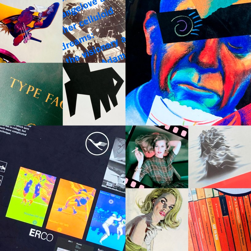
Designed by Peter Saville
Edited by Emily King
Frieze, London 2003
Anyone who bought records in the 1980s will be familiar with Peter Saville’s output.
This book was released to accompany a retrospective exhibition of his work at the Design Museum, then still in Shad Thames, which ran from May to September 2003. My ticket for the show is still in its pages and informs me that I saw it on 20th August.
As you might expect, the book is beautifully designed – by Christopher Wilson with Saville as ‘consultant’. It comes with a disposable banded seal in fluorescent orange and contains essays by the great and the good of music and design, including Paul Morley, Miranda Sawyer, Rick Poyner and Peter York, whose piece is very entertaining. York touches on how conventional 80s design agencies didn’t quite ‘get’ Peter Saville and always inferred that his approach wouldn’t work in mainstream design. As a design graduate who worked in one of those places, I can confirm this theory and how wrong they were – history shows that Peter Saville’s influence has been significant.
There was a time when I thought I’d seen him out and about in London. I was once in a shop in Neal Street queuing to purchase some sandals (my excuse is that I was about to go on holiday) I could of swore he was in front of me with his girlfriend. He even gave me a wry smile as if to say ‘Yeah, it’s me, I’m buying sandals too – what are we like!’ And then, maybe a year later, I’m sure I saw him at Euston station, in a hurry and looking very cool in a nice suit (him not me!)

70s Style & Design
Dominic Lutyens & Kirsty Hislop
Thames and Hudson 2009
We used to call the 1970s the decade that taste forgot. It’s true, some 70’s fashions verge on the comical. However, I think at the high end of 70’s couture the clothes feel incredibly stylish and glamourous.
They were formative teenage years for me. I think it’s fair to say that, from a style and design point of view you can divide those 10 years, more or less, between glam and punk.
When I was 11 years of age I used to love the group Slade. I was amused by their colourful larger than life image. Then, when I got a bit older, I moved on to Roxy Music whose future-retro glamour appealed to my embryonic arty ambitions. Both camps get a mention here.
The impact of punk was immense. When Never Mind The Bollocks Here’s The Sex Pistols was released in 1978 I remember being both shocked and impressed by Jamie Reid’s iconic ground breaking sleeve design. I still think it’s one of the greatest examples of that genre.
In 1994, during my time as a Graphic Designer for BBC News, I managed to contact Jamie and invited him in to Television Centre to talk to our department about his work. He agreed, we set a date, and I booked one of the meeting suites on the 6th floor. It was an interesting experience. Jamie didn’t really want to discuss his The Sex Pistols work, preferring instead to talk about more recent projects. The event was poorly attended – I remember feeling a bit stressed about it. I think some of my BBC colleagues felt his work was a bit dated. In fact I’m not sure some of them even knew who he was.
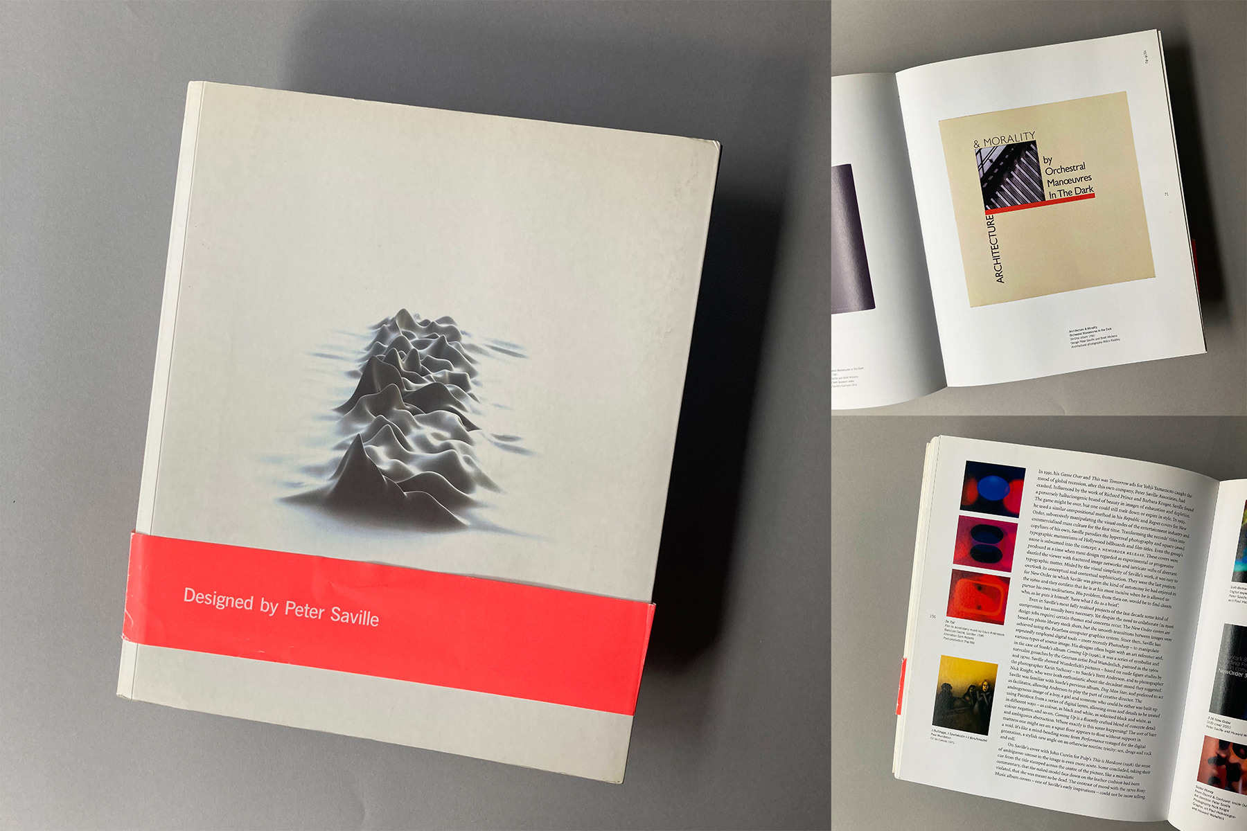
Otl Aicher
Markus Rathgeb
Phaidon 2006
I have a memory of seeing Otl Aicher speak at a design seminar in London in the late 2000s.
At that time my own career was at a bit of a turning point and I remember thinking how humble Aicher seemed for someone who had created so much important work. His grace and wisdom shone through the interview and I found him inspiring. Humility is a most underrated virtue.
Otl Aicher is probably best remembered for leading the design team that created the hugely influential visual identity for the 1972 Summer Olympic Games in Munich. The work still feels ultra modern fifty years later. The fascinating story of its development is recounted in detail amongst these cleanly designed pages.
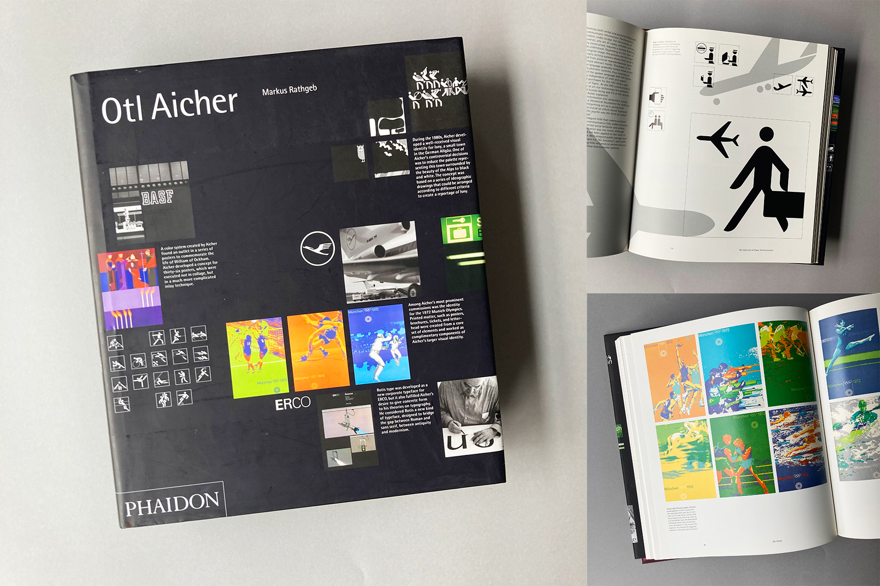
Art is Work
Milton Glaser
Thames and Hudson 2000
In the early 1980s, before I gave up my job to go to art school, I saw a documentary about Milton Glaser on Channel 4. I found him inspiring and it informed my desire to pursue a career in graphic design.
I recorded that programme on our then brand new VHS recorder and kept the tape for many years. I can still see my father’s simplistic handwriting on the box: Milton Glaser Artist. It still makes me smile.
A lot of Glaser’s iconic work is, of course, familiar. He’s a great proponent of the idea in graphic design. The sense that it’s not just about the pretty juxtaposition of words and images, it is actually about getting the message across in a clever and original way which makes it memorable. When I was at college there was a vague feeling amongst the cool kids that Milton Glaser was a bit dated and naff, a bit post-hippy – but not from me. I loved his work and still do.
I bought this gorgeous book for my eldest daughter when she was studying for her A Levels. It not only underlines Glaser’s design brilliance, but also highlights what a wonderful and versatile illustrator he was. Looking at the volume and breadth of his work again still inspires me to keep going and to keep working.
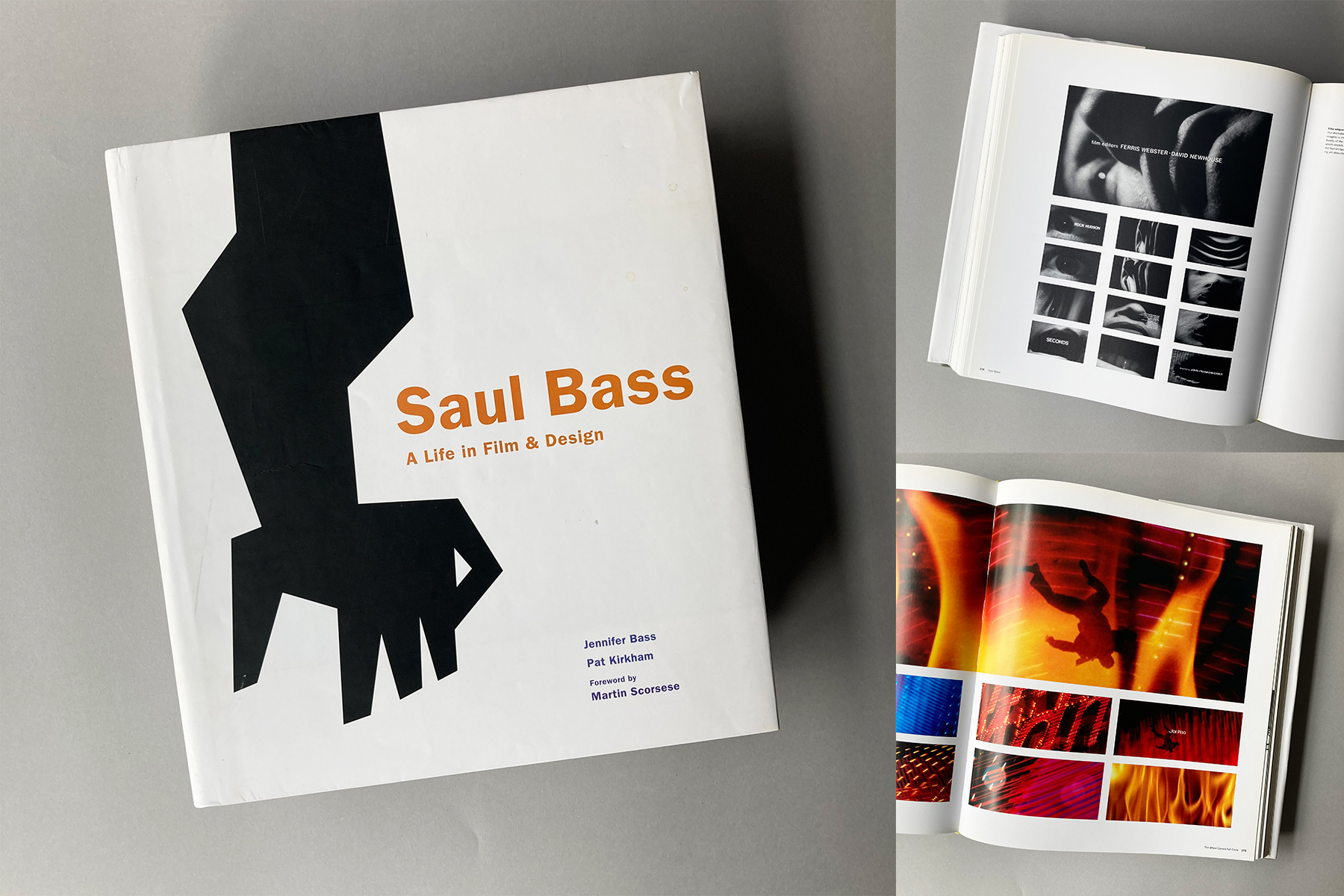
Saul Bass
A life in Film & Design
Jennifer Bass, Pat Kirkham
Laurence King Publishing 2011
I studied for a BA (Hons) in Graphic Design at Central Saint Martins from 1984 to 1987 – the exact middle years of the 1980s. I will never forget my time there and I feel privileged that I had the opportunity to attend that course. My local authority in Liverpool awarded me a student grant, covering my course fees and sending a cheque every term. As a council estate kid from a working class background I really appreciated it.
Central Saint Martins opened so many cultural doors for me. In my second year I attended a talk given by Saul Bass at the Barbican in London, it was part of an exhibition of moving image graphics curated by one of my lecturers. At that point in his career Bass was a sort of forgotten man. He had moved away from title design, focussing on his own film projects. Eventually he was rediscovered by some contemporary directors, including Martin Scorsese who very much put him back at the forefront of title sequence design.
At the Barbican lecture, Bass was very statesman-like. He mainly talked about a recent short film he directed with his wife Elaine; an adaption of a Ray Bradbury sci-fi story called Quest. Bass was clearly very proud of the work, and said he was pleased that they had achieved a lot of the special effects ‘in camera.’
This delightful doorstep of a book was released in 2011 and is a thing of beauty. It covers all of Saul Bass’ career, including his branding work (It used to be called ‘corporate identity’) and, of course, all those fabulous title sequences.
His final glorious piece was for Martin Scorsese’s Casino and released in 1995, a year before his untimely death at the age of 75.
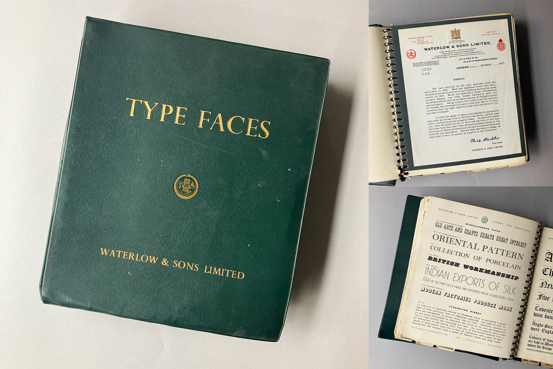
TYPE FACES
Waterlow & Sons Limited
Waterlow & Sons Limited 1957
This isn’t really a design book as such, it’s a 65 year old ringbound typeface catalogue.
It was presented to me by my wife many years ago. She rescued it from a skip at the design agency where she used to work. I’m forever grateful because it’s a lovely thing.
Waterlow & Sons Limited were a printing company founded in 1810, specialising in the engraving of bank notes, postage stamps and stocks and bonds certificates. The company was acquired in 1961 by De La Rue and formally dissolved in 2009.
This catalogue contains an introductory letter from then chairman Philip A Waterlow. Typewritten on a stunningly beautiful gilded letterhead, it’s opening paragraph reads:
The last edition of our type specimen book was published in 1935. Much has happened since that date, including the destruction of our Finsbury factory by enemy action in 1940.
The book is a fine example of what type catalogues used to be about before Macs changed everything. It contains casting off charts, ‘poster’ type and a lovely section featuring rules and borders which includes a charming Christmas page.
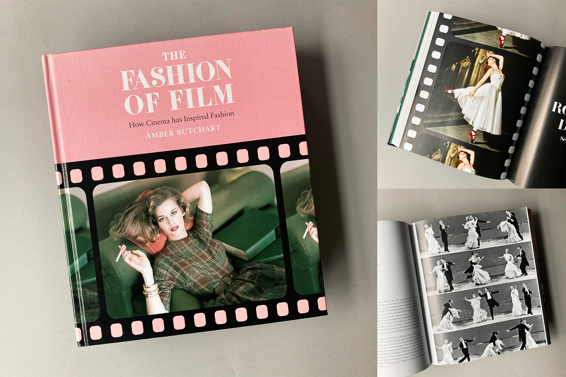
THE FASHION OF FILM
How Cinema has Inspired Fashion
Amber Butchart
Mitchell Beazley 2016
Fashion historian Amber Butchart browses through a wide selection of films to reflect on how clothes in movies have influenced high-end fashion and couture. A novel idea, lovingly researched with an extensive array of visual reference. It’s a joy to leaf through it’s glossy and stylish pages.
All cinematic genres are represented – crime, musicals, historical epics, horror, romance, sci-fi, and arthouse.
The section on the Fred Astaire and Ginger Rogers musical Top Hat (1935) tells us that Fred loved English tailoring. It also explains how the film was referenced in 1970s pop art textile design and became a major influence on 2010s catwalks. Style endures.
Elsewhere, we learn how The Italian Job (1969) showcased the contemporary mod look, the many times Powell and Pressburger’s The Red Shoes (1948) influenced couture collections, and how even Saul Bass’ graphic design work on West Side Story (1961) fed into recent London street fashion. There are essays on 45 films in all – a sumptuous treat for both movie buffs and fashionistas.
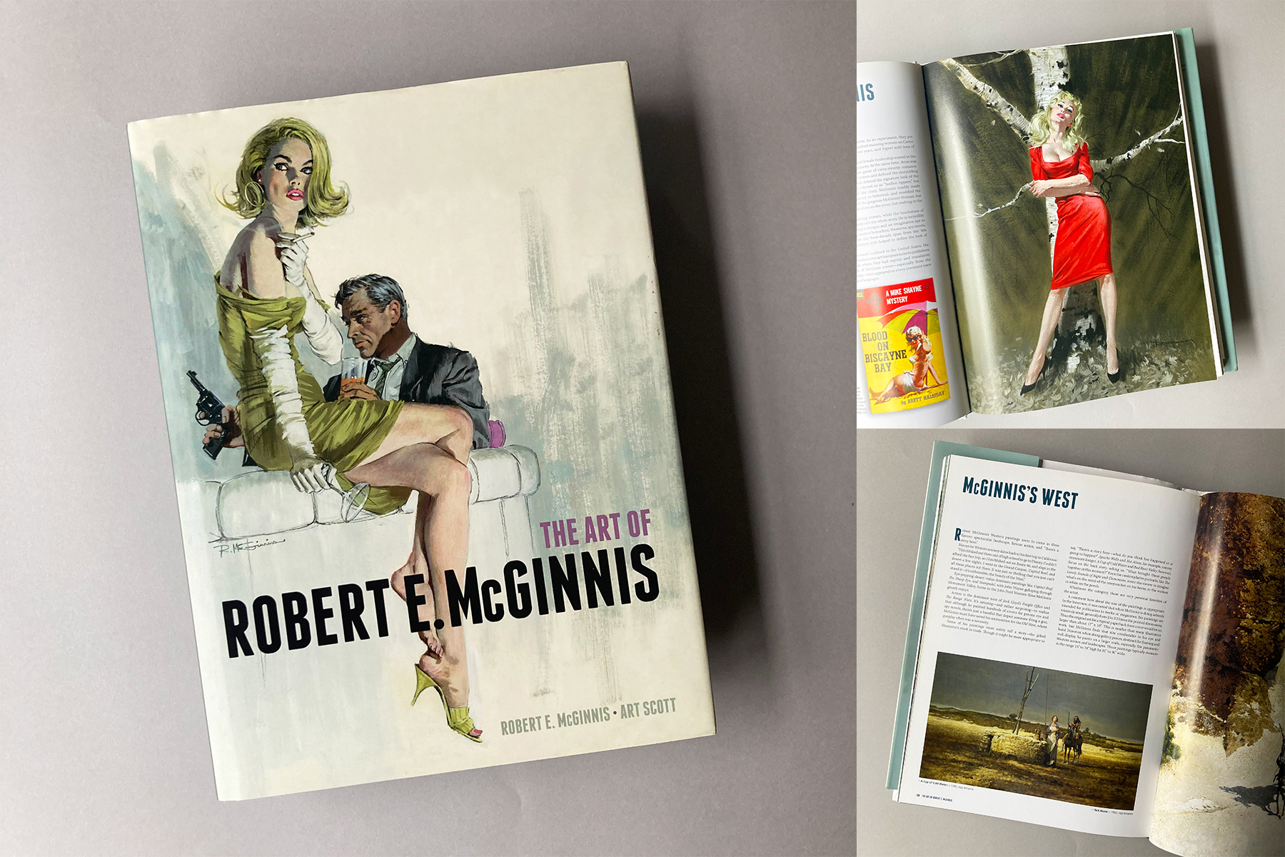
The Art of Robert E McGinnis
Robert E McGinnis, Art Scott
Titan Books 2014
There is a particular old school Hollywood style about Robert McGinnis’ paintings that I absolutely adore. His pictures radiate a dangerous faded glamour. Potent and beguiling, they feel like a product of another more romantic age.
McGinnis has created cover art for over 1200 paperbacks, including detective stories, romances and westerns, making a significant contribution to the pulp novel boom of the 1960s and 70s.
He also illustrated campaigns for 5 James Bond films which is where I first experienced his work. As a child in Liverpool I was enthralled by his Thunderball poster which had caught my eye from the window of the 79 bus. I always wanted to own one of his authentic Bond film posters. Eventually I found an original US one sheet of The Man With The Golden Gun. It now hangs on our living room wall.
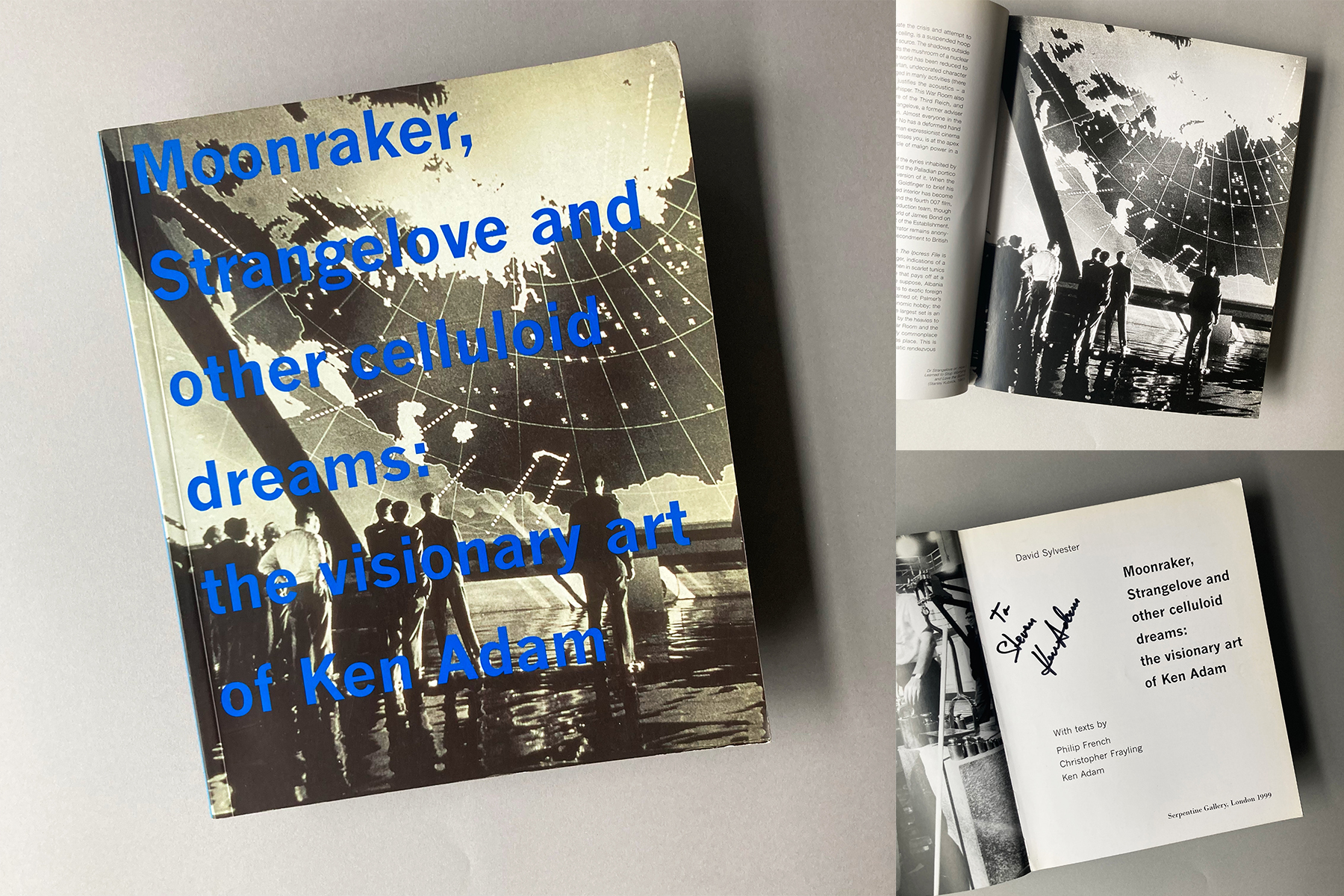
Moonraker, Strangelove and other celluloid dreams:
The visionary art of Ken Adam
David Sylvester et al
Serpentine Gallery 1999
I have spoken elsewhere about my admiration for the work of Ken Adam, legendary production designer and two times academy award winner for Barry Lyndon (Stanley Kubrick,1975) and The Madness of King George (Nicholas Hytner, 1994).
Designer of seven James Bond films, Adam’s beautiful and futuristic sets we’re an integral part of the 007 cinematic experience in the 1960s and 70s.
I saw him interviewed by Christopher Frayling at a D&AD event in 1999. He was a witty and gracious storyteller. I was fortunate enough to be chosen to ask a question from the audience. My colleagues expected me to enquire about designing for 007 but a voice inside my head told me that he’s probably bored talking about Bond films, and he’d already spoken at length about the subject in Frayling’s interview, so I asked him about working on Chitty Chitty Bang Bang. He replied saying that his work on the film drew on his German heritage and knowledge of Bavarian castles.
After the lecture he signed my copy of the book in his famously stylish and familiar (to me at least) handwriting.
Many years later whilst at Formula E, I was involved in the refurbishment of our Hammersmith office. It fell to my team to create a suitable design to be rendered on the large glass wall which ran the entire length of our vast boardroom. We developed a global map-based design, with lines of latitude and longitude, featuring all the cities that Formula E had raced in. I’m not ashamed to say it was heavily influenced by Ken Adam’s giant map in the war room of Dr Strangelove, which he designed in 1964. A homage to genius.
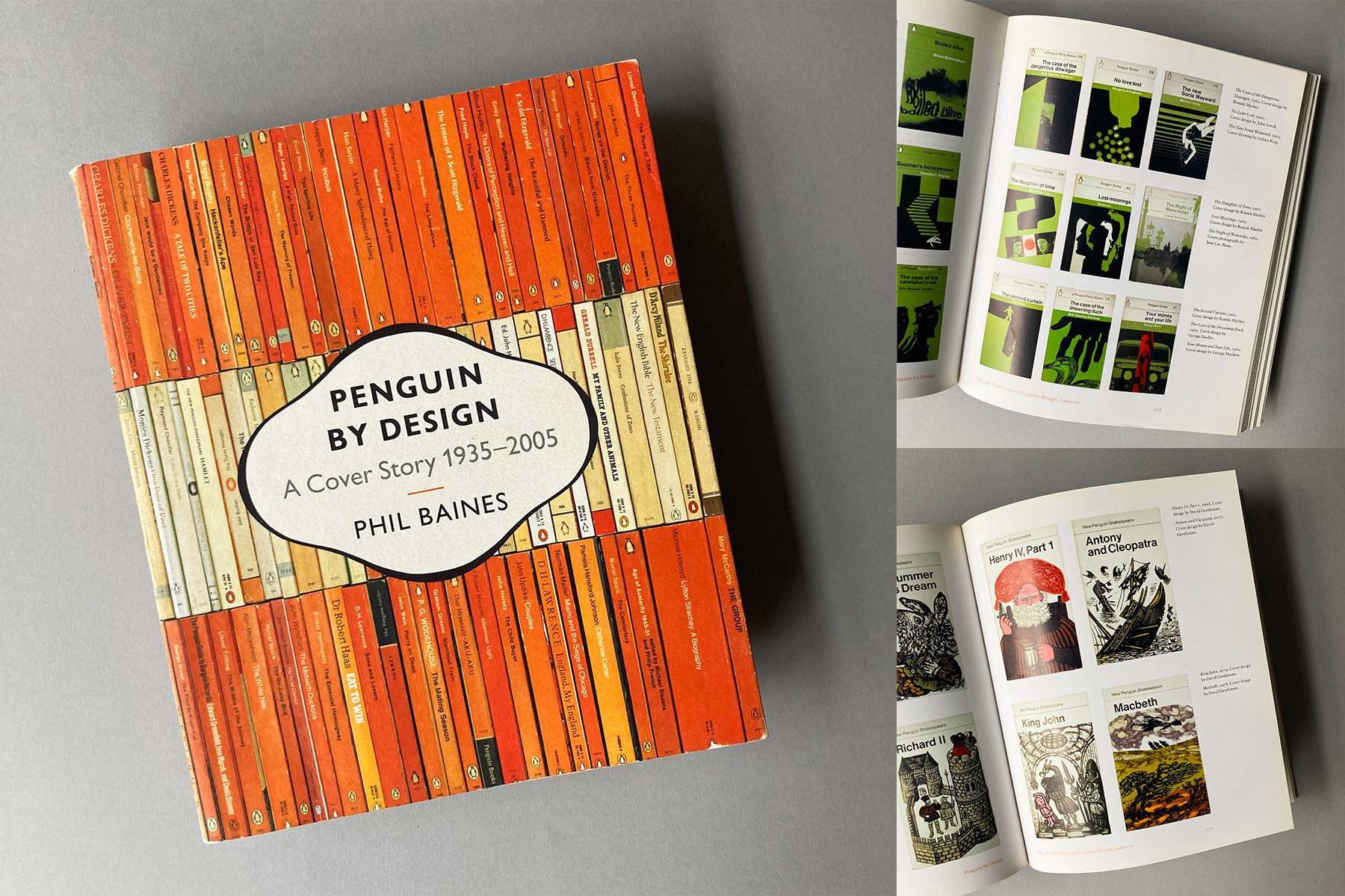
Penguin by Design
A Cover Story 1935 – 2005
Phil Baines
Penguin 2005
I am the sort of person who buys books that I already own just because I like the cover.
Having always been an admirer of Penguin books’ creative history and a keen follower of their approach to design, I have become obsessed with the ‘Marber grid’ which was Introduced in 1962 when Penguin Art Director Germano Facetti commissioned Designer Romek Marber to develop a new cover approach for Penguin’s crime catalogue. Marber’s solution maintained typographic consistency across the series while allowing for individual graphic imagery or illustration. The look was also rolled out across Penguin fiction and the Pelican imprint.
I now own quite a lot of Penguins from this period. Often purchased from second hand bookshops or charity shops. Although I know there’s a finite amount of shelf space in our house, I just can’t help myself. I have been known to line them up and take artfully composed photographs of them. I love the way that they are both uniform and individual.
This lovely piece of timeless graphic design is explained on pages 102 and 103 of Phil Baines’ wonderful book. Contained within are other examples of Penguin’s creatively rich design history including the lovely Shakespeare series illustrated by David Gentlemen, and the fascinating evolution of Penguin Modern Classics.
The esteemed Mr Baines was 2 years above me at Central Saint Martins in the 1980s.

Great selection of books Steve, I might have to revisit a few of this, I never actually purchased any of them, but recall a few in our library.
Hope all well
Rob Crotty
Thanks Rob!
Appreciate the feedback. All well here – hope you are too.
Very best,
S.