Throughout the restless days of lockdown, I had been looking for a task that would exercise my creative muscles. I wanted to fill time constructively whilst keeping my brain active and my design sensibility focused.
I once heard a beautiful version of Sonnet 29 performed by Rufus Wainwright and Florence Welch. This inspired me to investigate more of Shakespeare’s sonnets and consequently, I began to consider creating some sort of graphic work based on this wonderful and evocative verse.
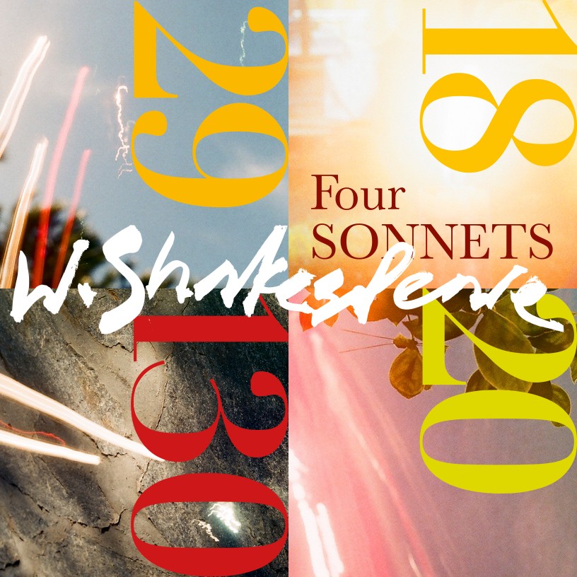
I decided to design a series of posters, each one featuring a different sonnet. Keen to counter the bleak news and dark mood of recent months, I developed a fresh and colourful modern aesthetic, using an impressionistic interpretation as opposed to a literal one. I was keen to avoid visual cliche. By using calligraphy, scale, and some of my double-exposure film stills I was able to create four graphic pieces, each juxtaposing meticulous typography with abstract design.
Not much of Shakespeare’s personal life is documented and we do not know for certain if the concepts expressed in these sonnets are autobiographical, works of fiction, or commissioned. This ambiguity really inspired my impressionistic approach.

Sonnet 18
For me, the first line sets the tone by evoking carefree youthful days spent in summer sunshine. This, in particular, was the focus of my graphic interpretation of Sonnet 18. My choice of image with it’s central glare of light represents the writer’s idea that sometimes the sun shines too hard – the gold and hot red of the colour palette support this – like the tipsy, hazy feeling from sitting for too long drinking in a pub garden at the height of summer.

Sonnet 20
The reference to a woman’s painted face made me recall the bright, vibrant make-up of a 1960s fashion model. Hence, the hand drawn headline is rendered in hot pink, like a vivid flourish of lipstick, with the lime green numeral an intense, complimentary eye shadow. The double exposure image finds nature gilding foliage with a luminous blush of rouge.
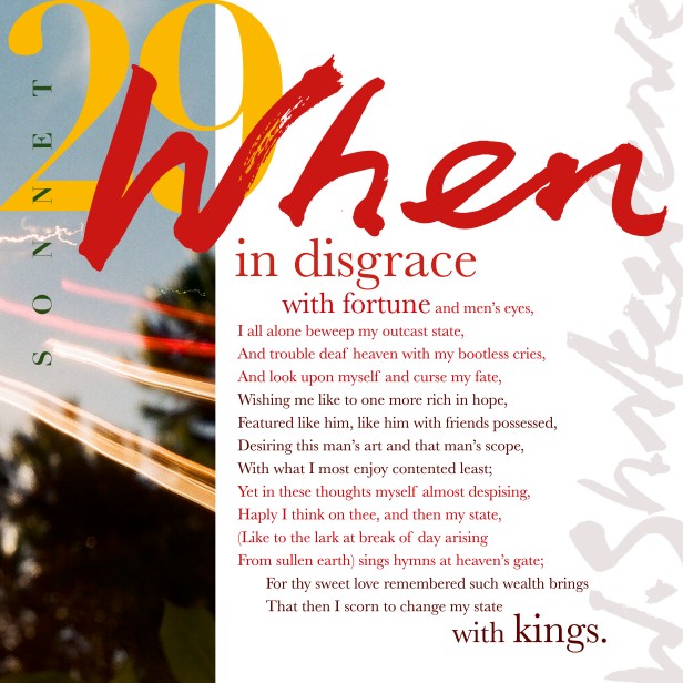
Sonnet 29
My visual interpretation of this sonnet is derived from the exact point where the writer is rescued from his sadness by suddenly thinking of their lover. This moment of realisation feels like a switch being flicked from grief to joy; an electrical charge, exemplified in the accompanying image by dynamic neon volts of orange and red, echoed in the colour palette and verve of the typography.
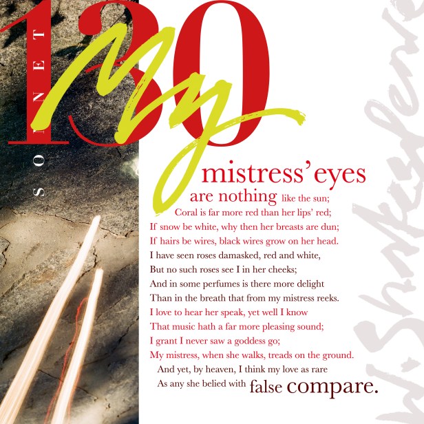
Sonnet 130
The writers preference for a realistic view of his lover, as opposed to fanciful comparisons, informs my choice of a more muted image in this piece. One of an earthly texture – kissed by sunlight as indicated in the first line – perhaps the ground his mistress treads on.
