
Before computers changed everything, creative individuals would work on their ideas using traditional art and craft techniques like drawing, tracing and cutting things out.
Recently, I unearthed a bundle of old sketchbooks from my days at Central Saint Martins where I studied for my Graphic Design degree from 1984 to ’87. These were the years just prior to when the shift towards digital changed working practices.
Looking at these workbooks 35 years later highlights some interesting comparisons with the way we work now. In most cases, at the beginning of a project, we would literally start with just a blank page and our imagination. Research would involve a trip to the library or a visit to a gallery or museum for inspiration. These days we have every piece of reference we could ever need at our fingertips, it makes me wonder if that makes the creative process any easier.
In retrospect, it feels like the ability to draw was, and still is, crucial – to explain your ideas figuratively, express your thinking visually, and show your working out on the sketchbook page. All important, particularly at college.
Another great discipline from those days was the hand rendering of letterforms. Having to trace each individual character or photocopying the selected font from a type book, cutting each letter out separately and sticking them together. It was a painstaking process but it really did bring focus to the art of typography. I worry that, perhaps, this skill may be lost to convenience.
Below is a selection of layouts which showcase the development of ideas from several different projects. In some cases, you can see the ideas sparking and taking shape, flowing from page to page.
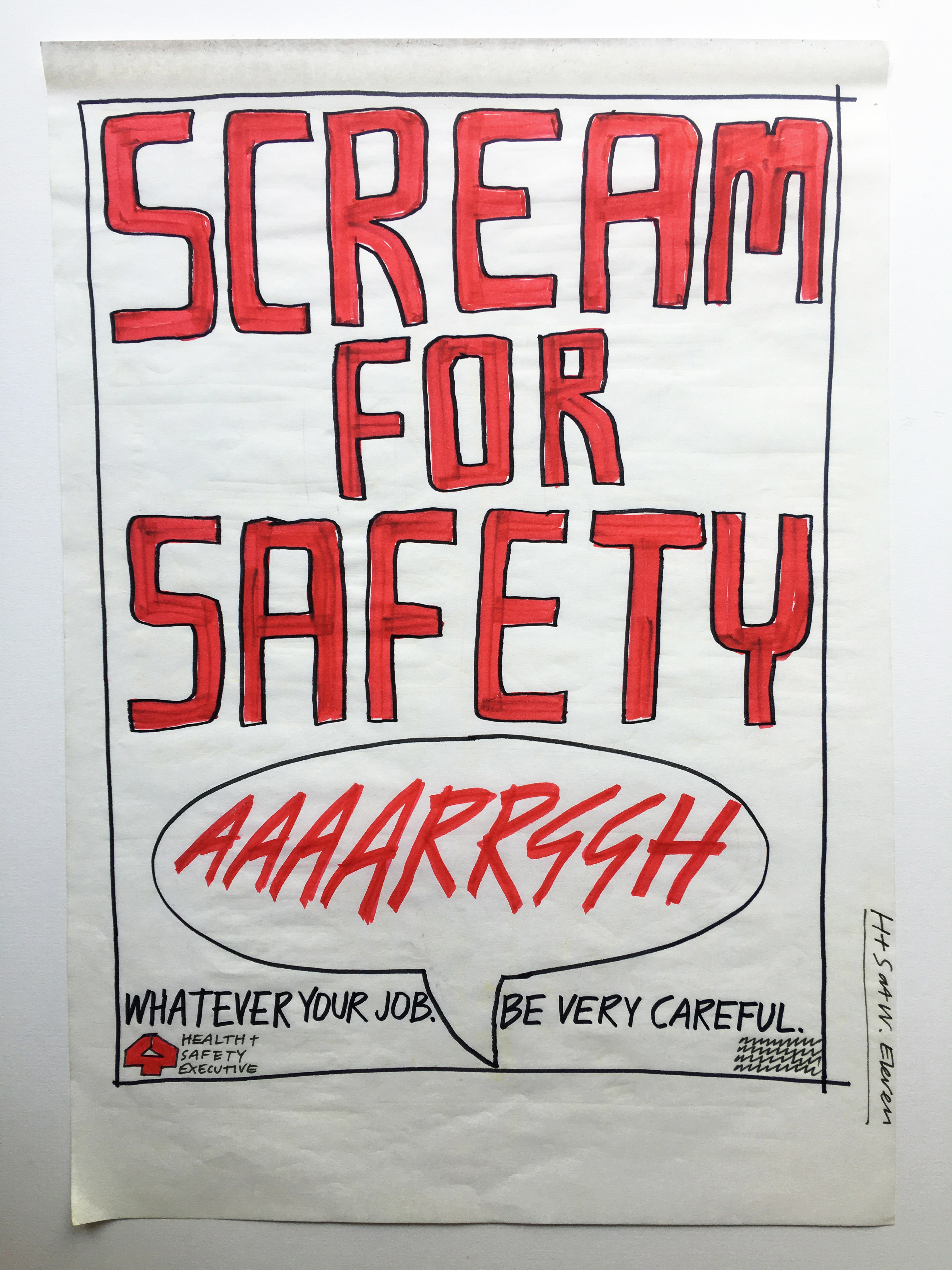
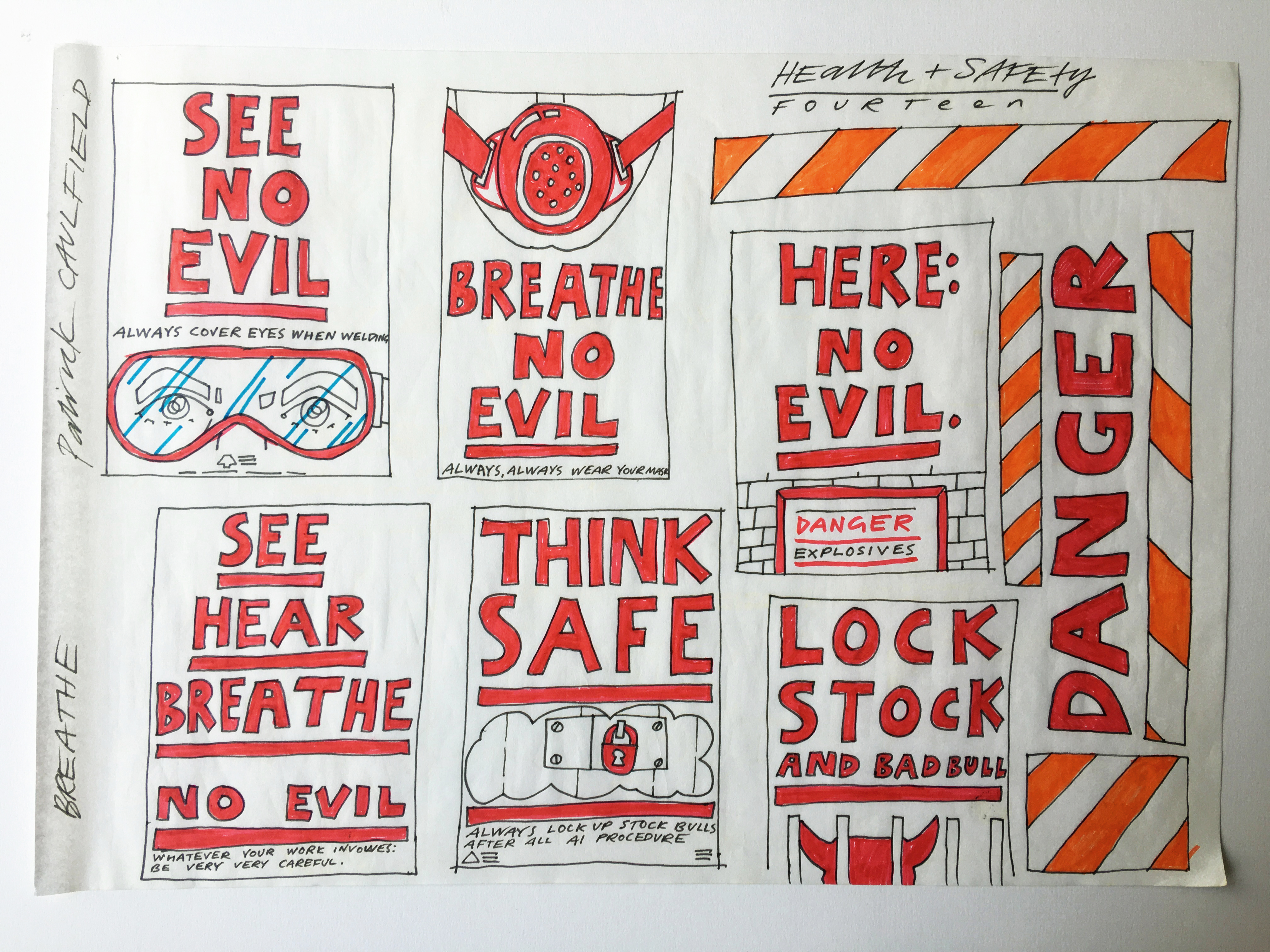
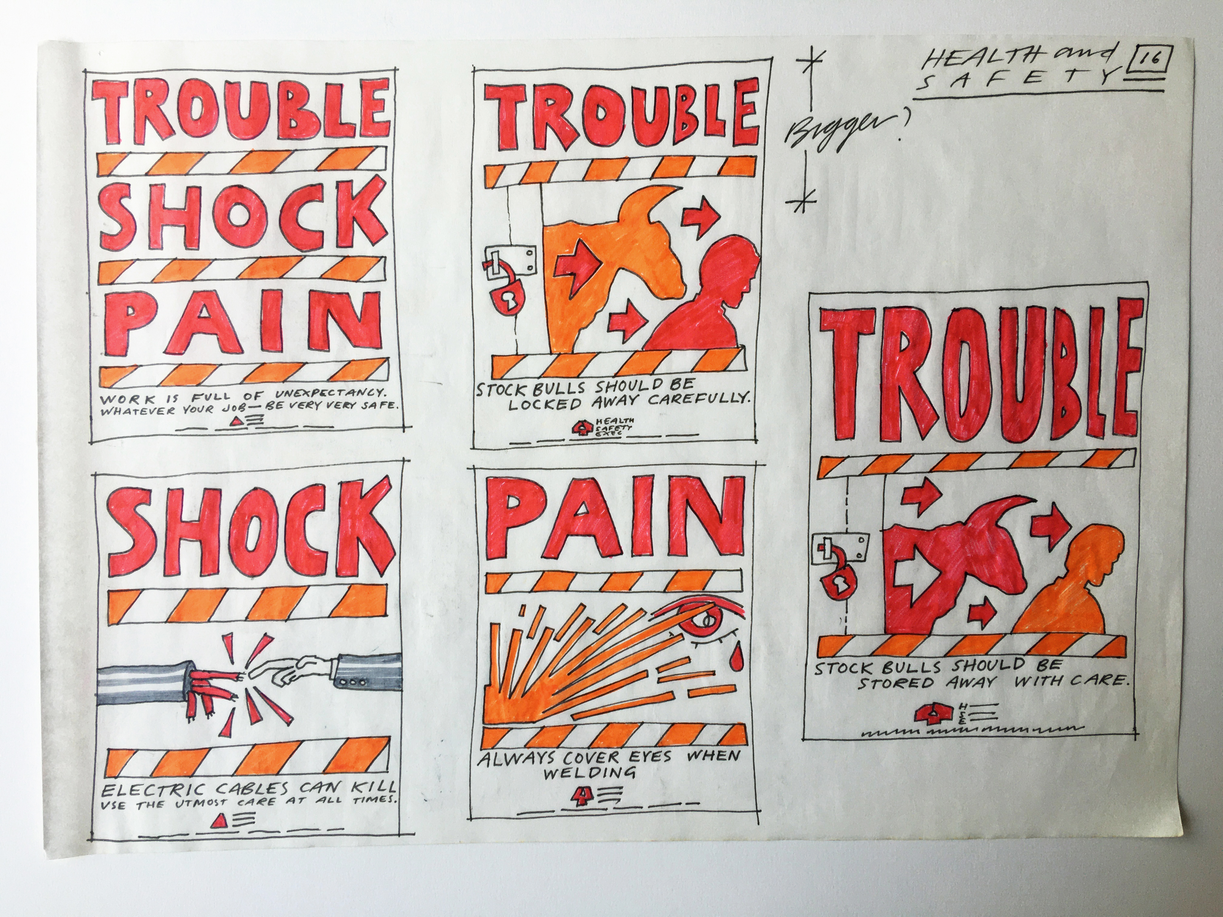
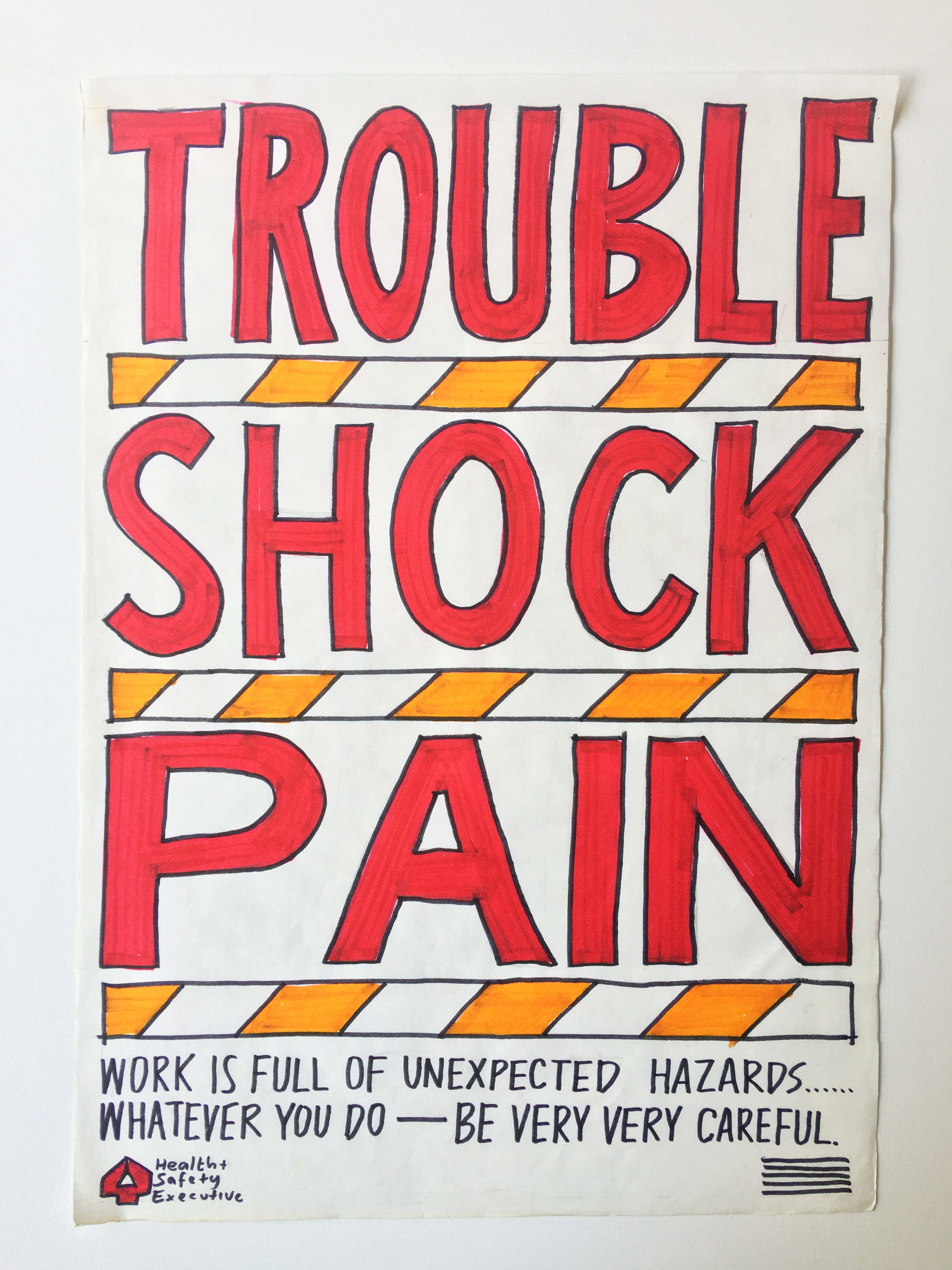
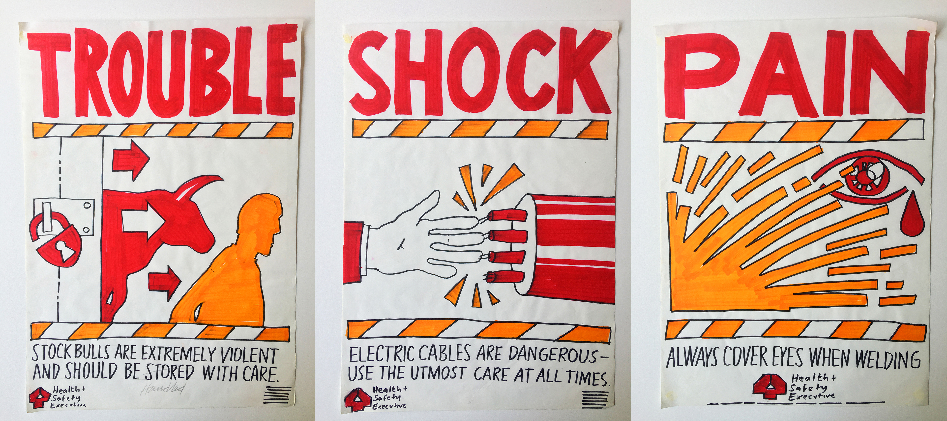
HEALTH & SAFETY EXECUTIVE
The brief asked for a series posters that would encourage people in workplaces and factories to follow HSE safety first guidelines.
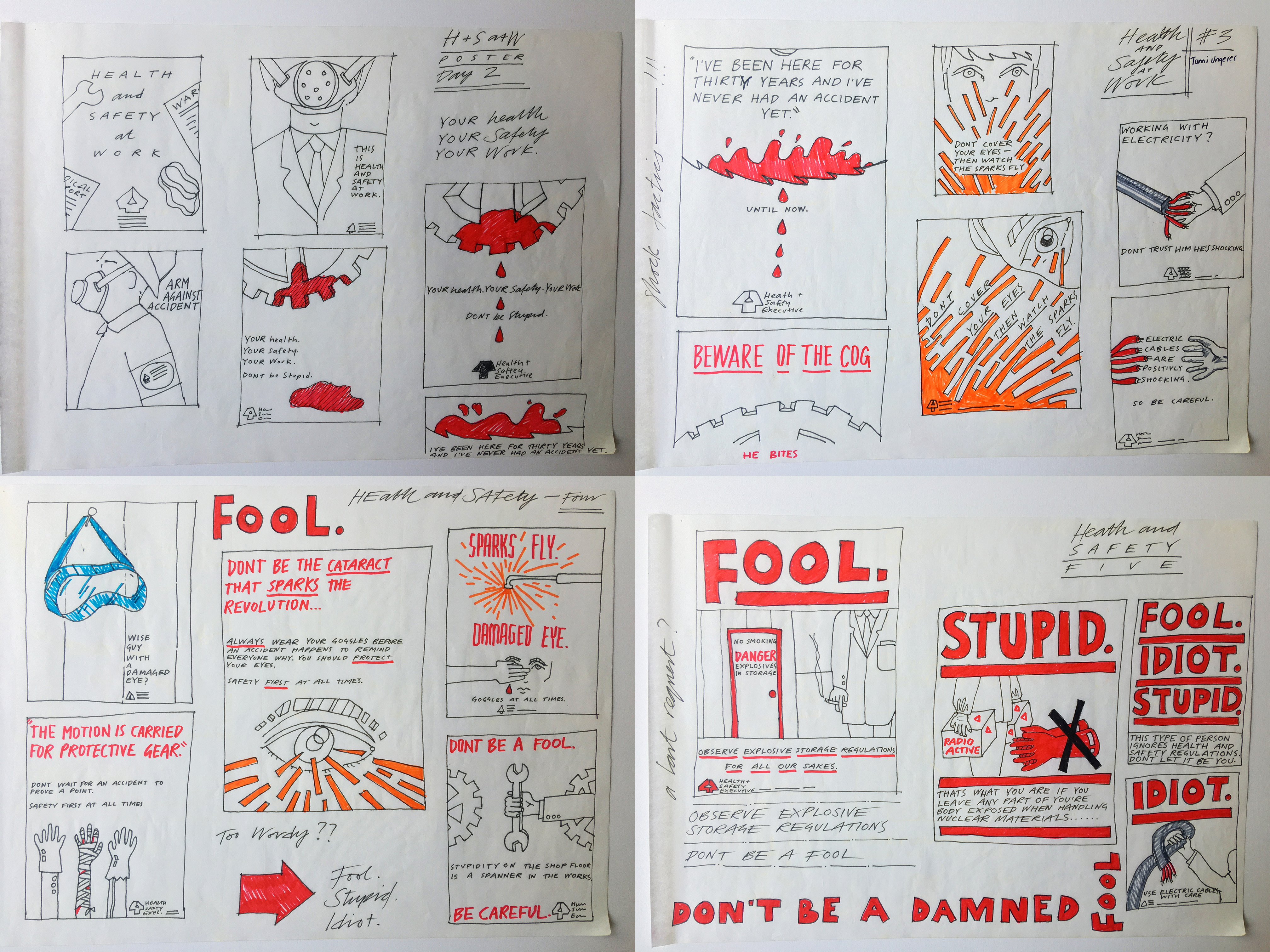
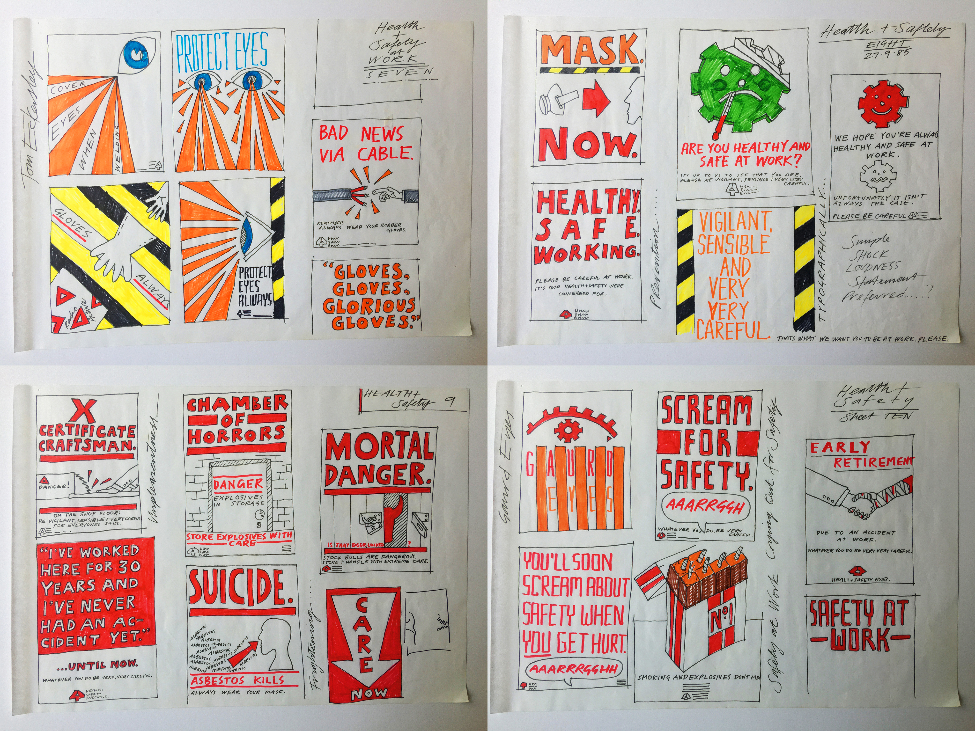
My approach was to create bold, shouty designs in primary colours, using strong typography, referencing the visual language of industry and the immediacy of traffic signs. Looking again at the development process, I can see that I was a slightly influenced by Abram Games, who I’d only recently discovered.
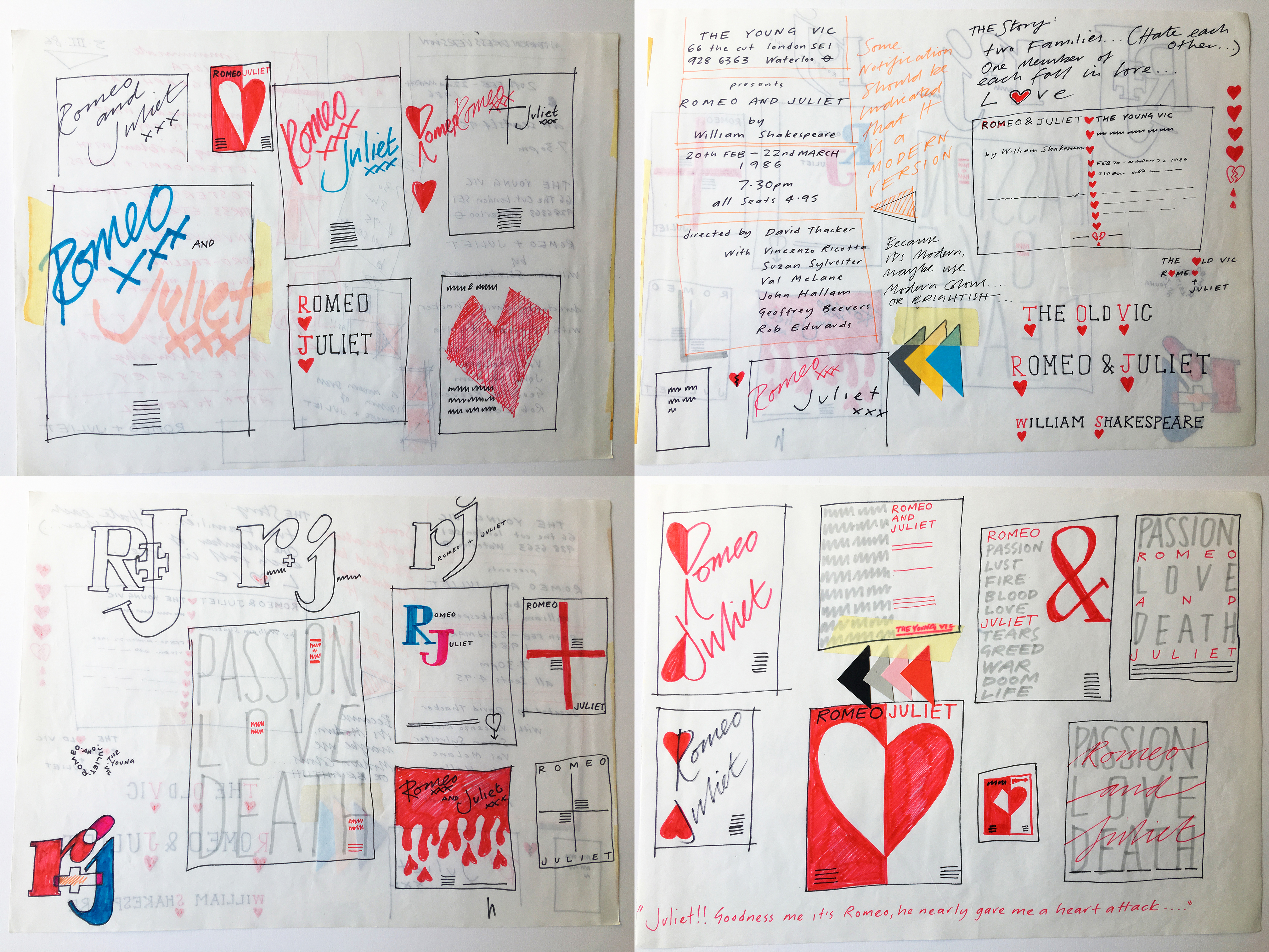
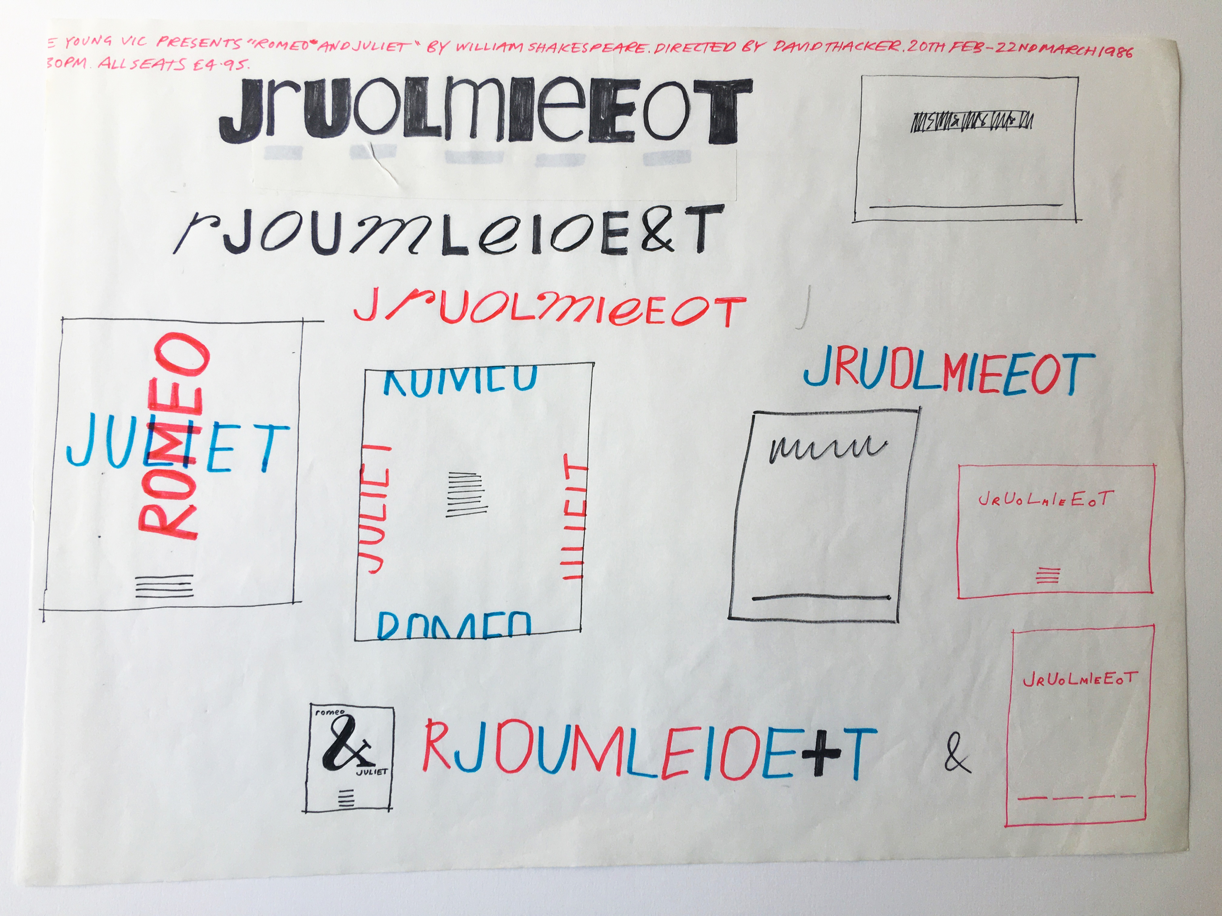
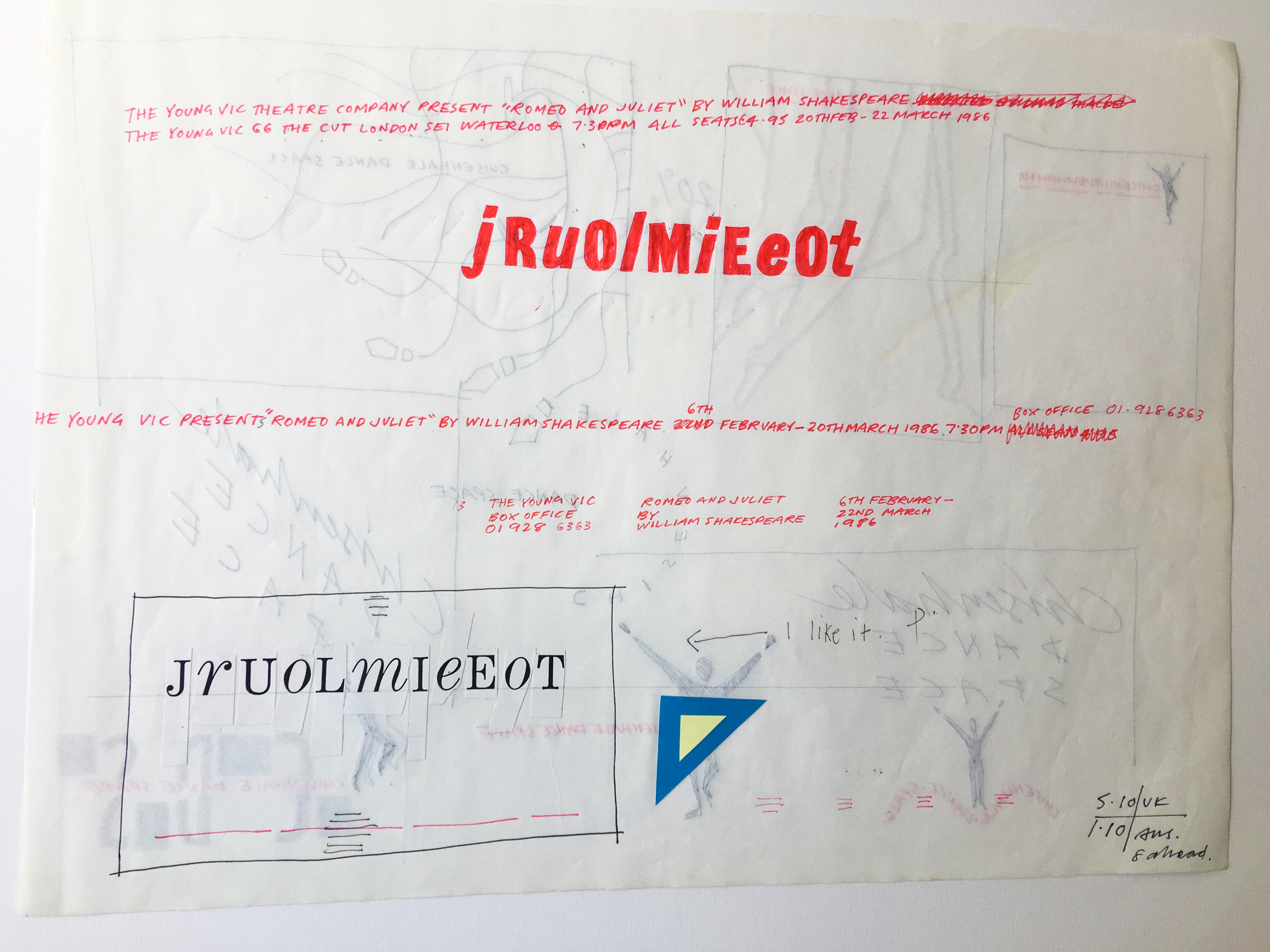
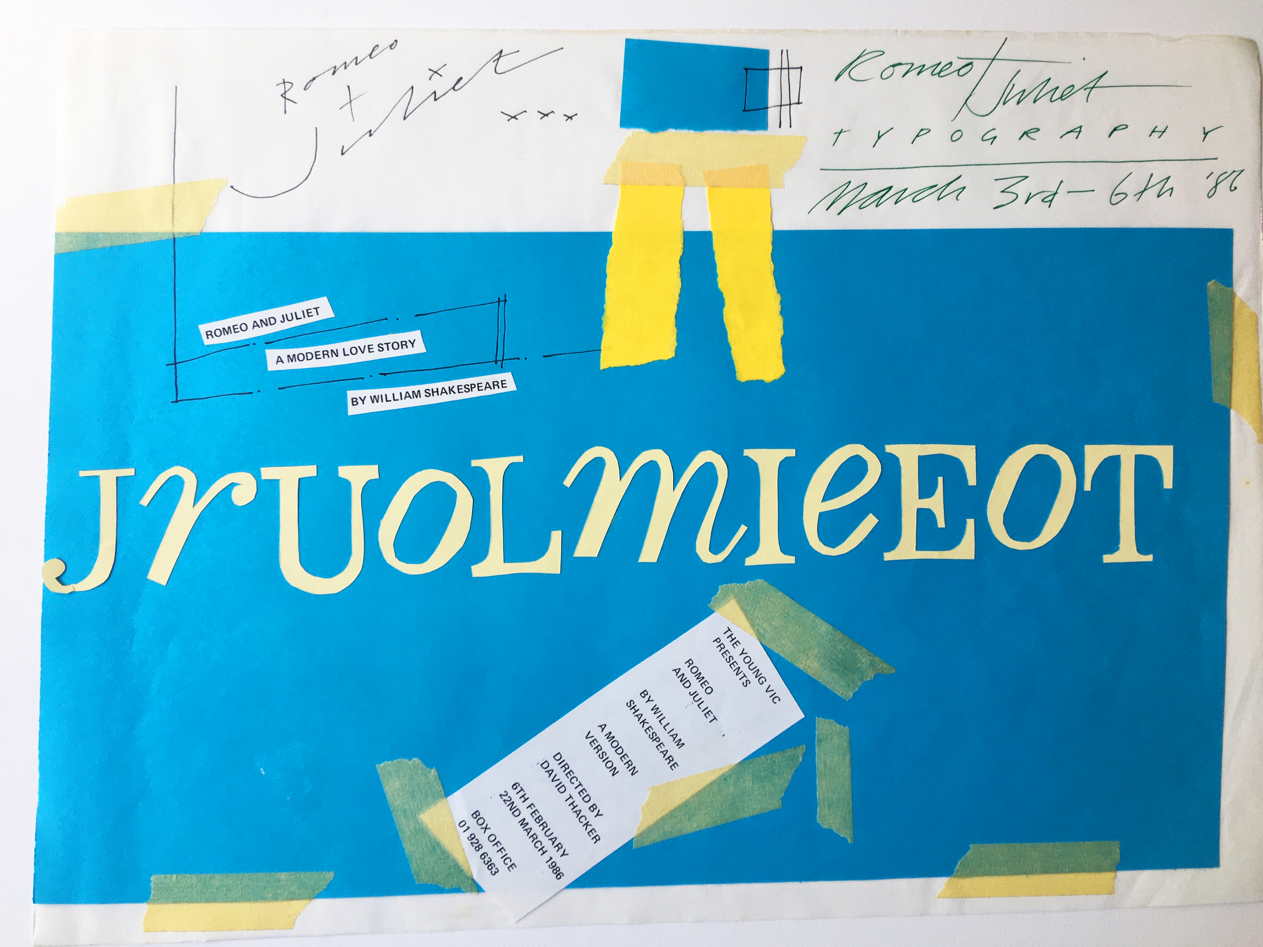
ROMEO AND JULIET
The brief for this project requested a pure typographical solution. I didn’t want to ‘just’ create something that was pretty, I wanted to make a statement about the relationship between the two main characters – to do something that had an idea behind it rather than be merely aesthetically pleasing. You can see in my working out how I grappled with this.
I remember screen printing several different colour ways of the final design in the wonderful college print studio. I gave most of them away as presents to friends.
INTERNSHIP
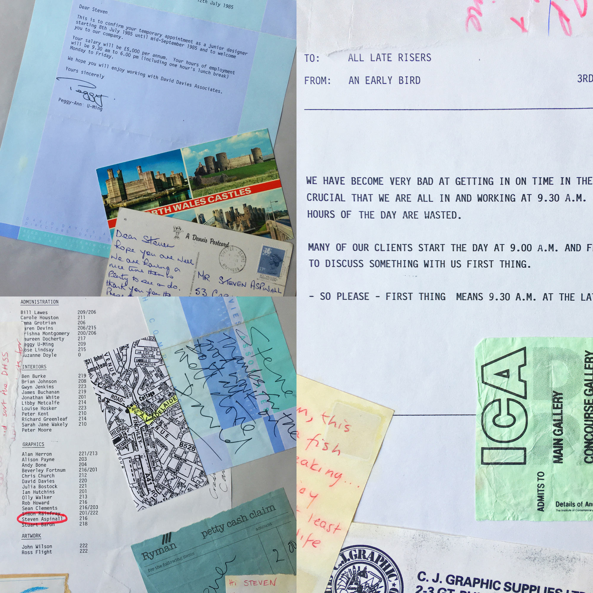
In the Summer of 1985, between first and second year, I was fortunate enough to be employed as a Junior Designer at David Davies Associates who were, and still are, a very successful London design agency.
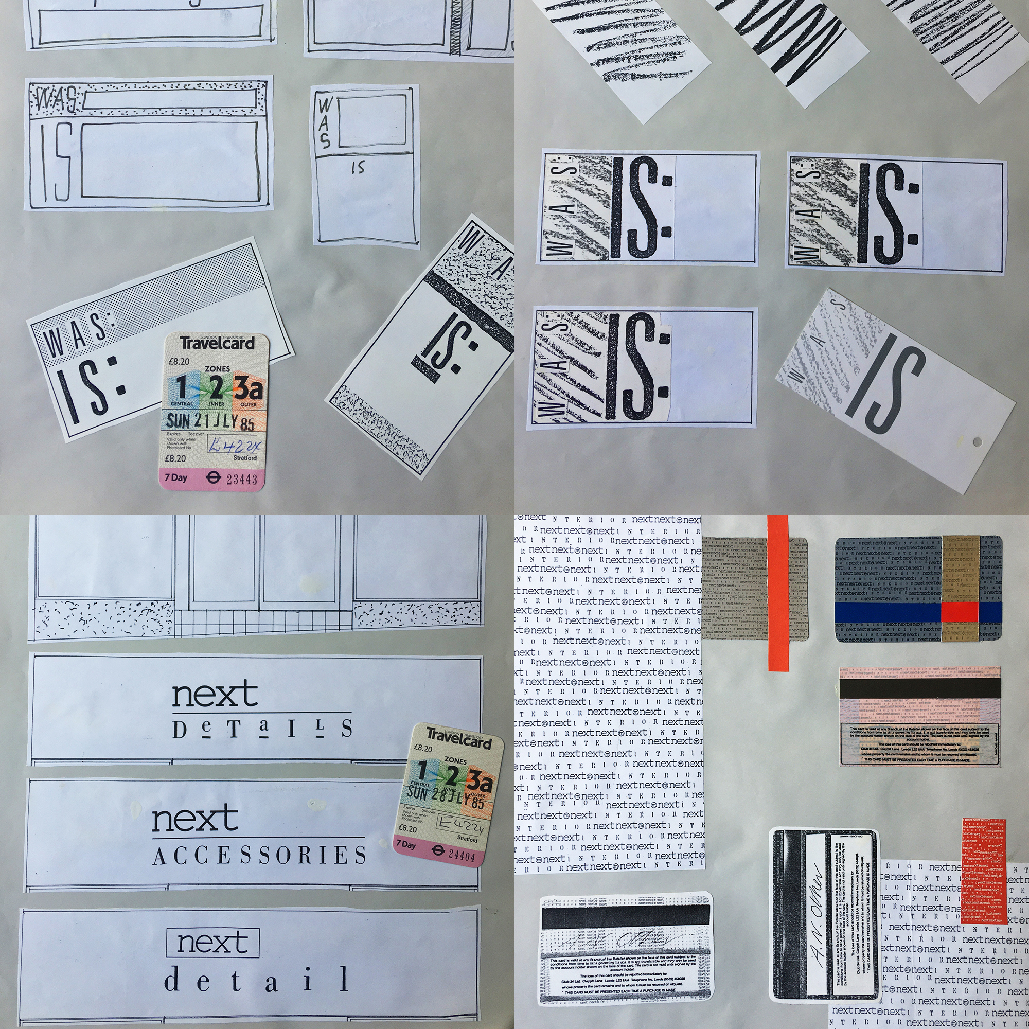
I was very naive. This was my first experience of Design as a ‘proper grown up’ profession. The team at DDA were lovely and I learned a lot. These pages are from the scrapbook I put together when I returned to college for the new term. It contains snippets of work from major projects for companies like Next and WHSmith, as well as fragments of agency life, tube tickets and notes my girlfriend used to leave in my packed lunches. Again, appreciate the hand drawn, cut and paste process.


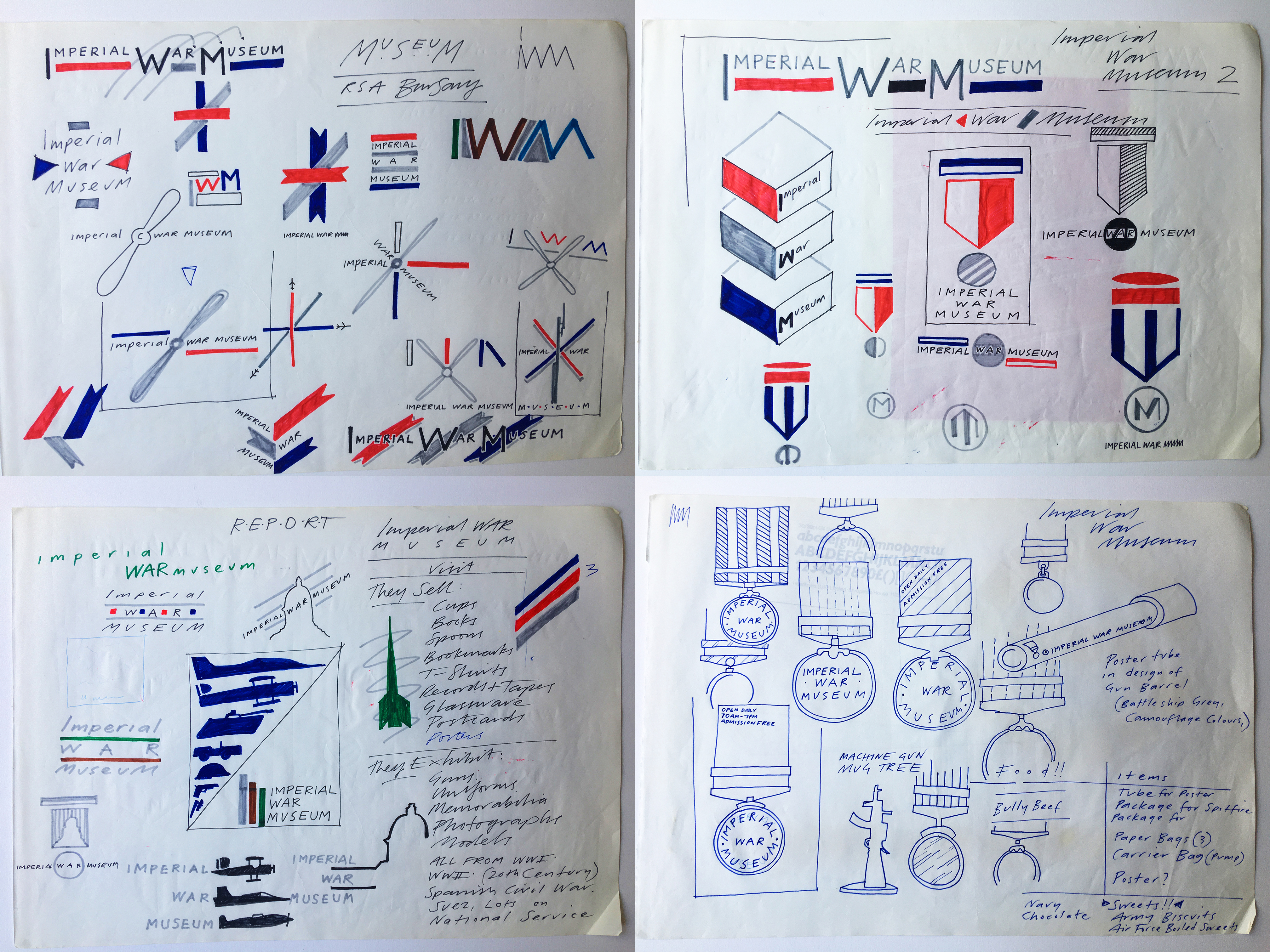
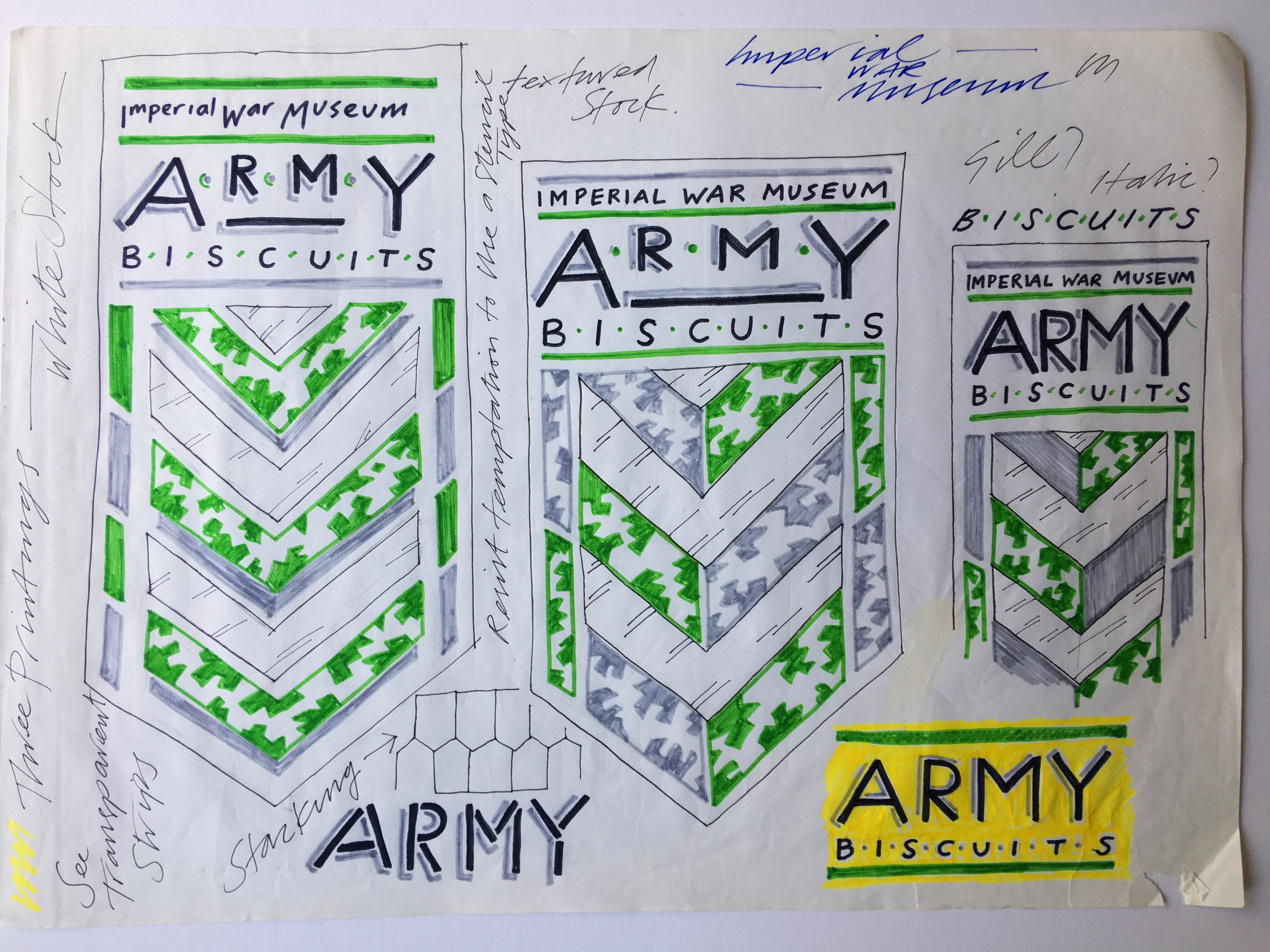
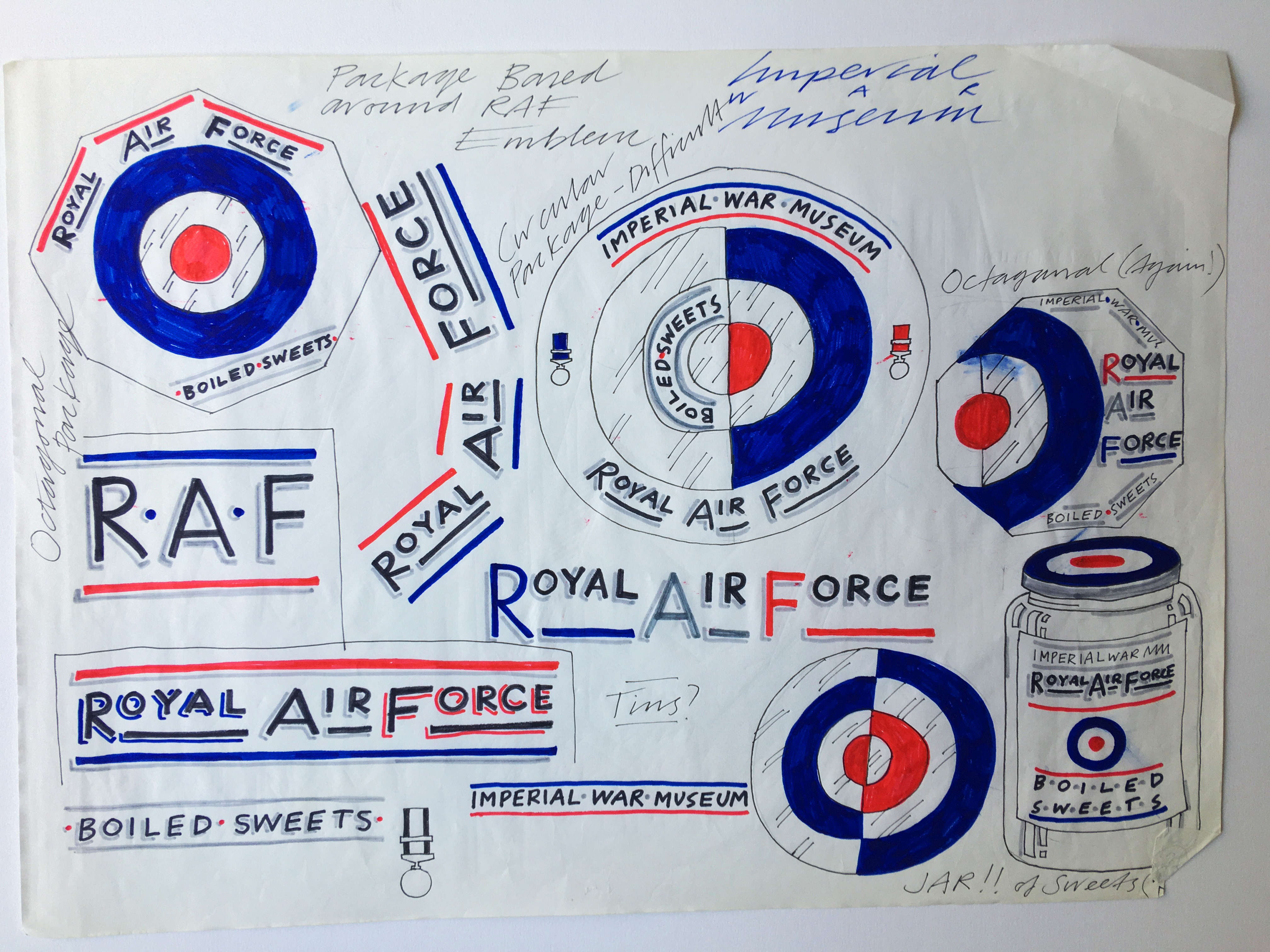
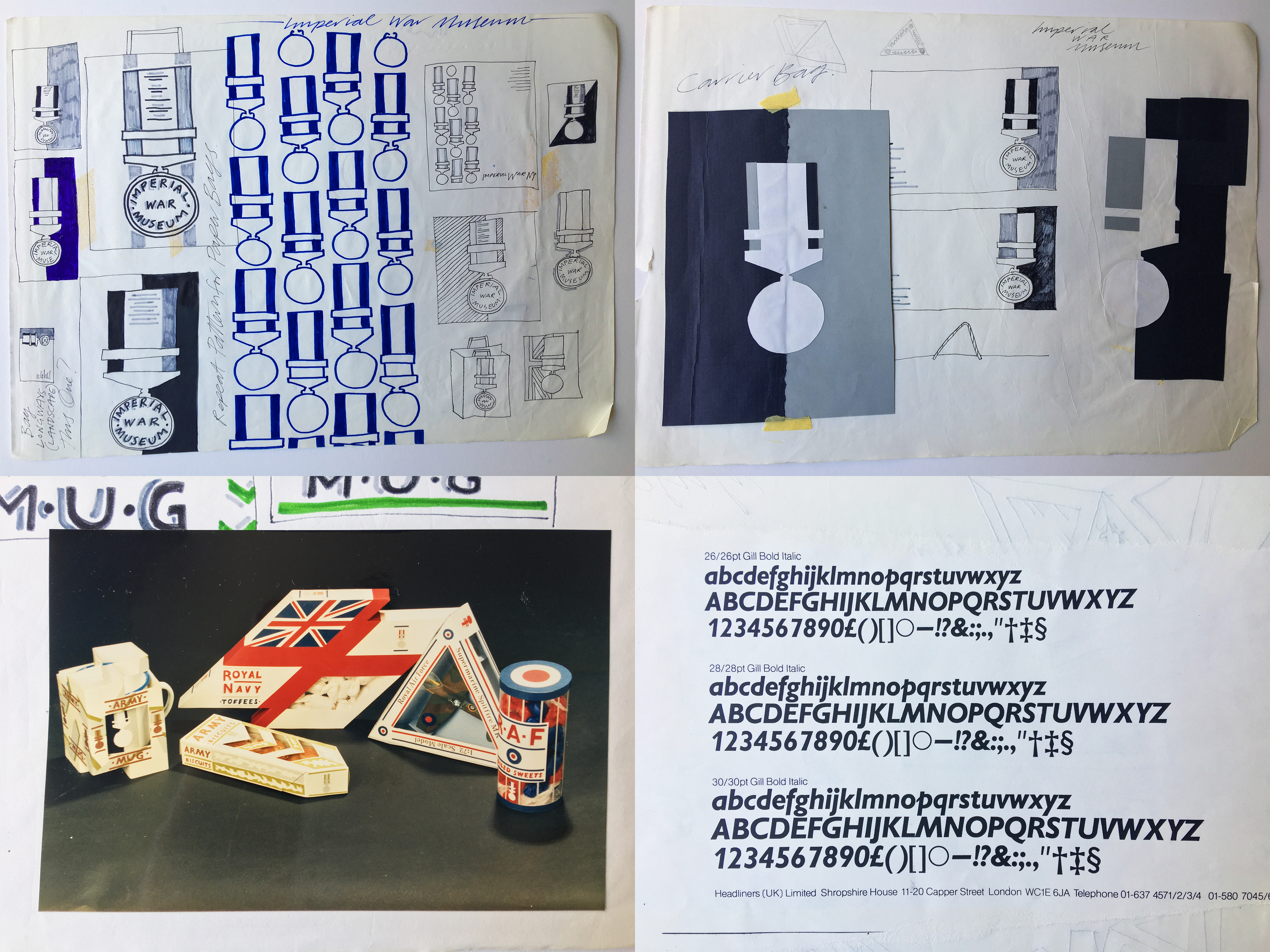
IMPERIAL WAR MUSEUM
This was my entry into the 1987 Royal Society of Arts Student Design Bursary, a nationwide competition for all final year design students. The brief was to design a range of packaging for a museum.

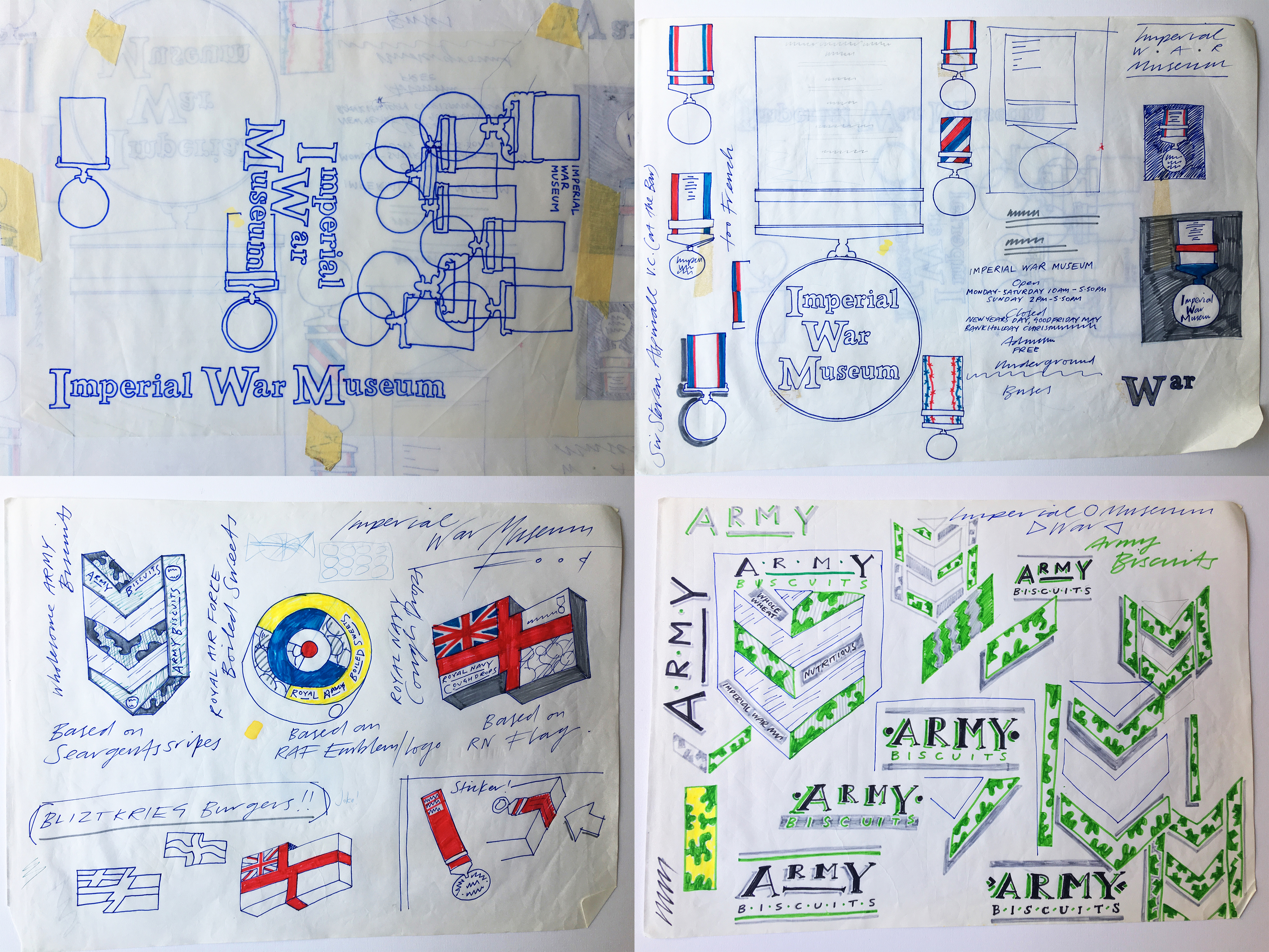
I remember visiting the Imperial War Museum for research and being quite impressed. I’m still pleased I managed to get an element of wit into the design by utilising the shape of the army stripes and the Royal Navy ensign in the packaging solutions, and I think the medal motif strikes the right note of respect for a sensitive subject.
I ended up being one of the winners of the competition and was awarded a travel bursary from the RSA. I subsequently spent a memorable fortnight in New York in the Autumn of 1987 where I interviewed my favourite magazine designers.

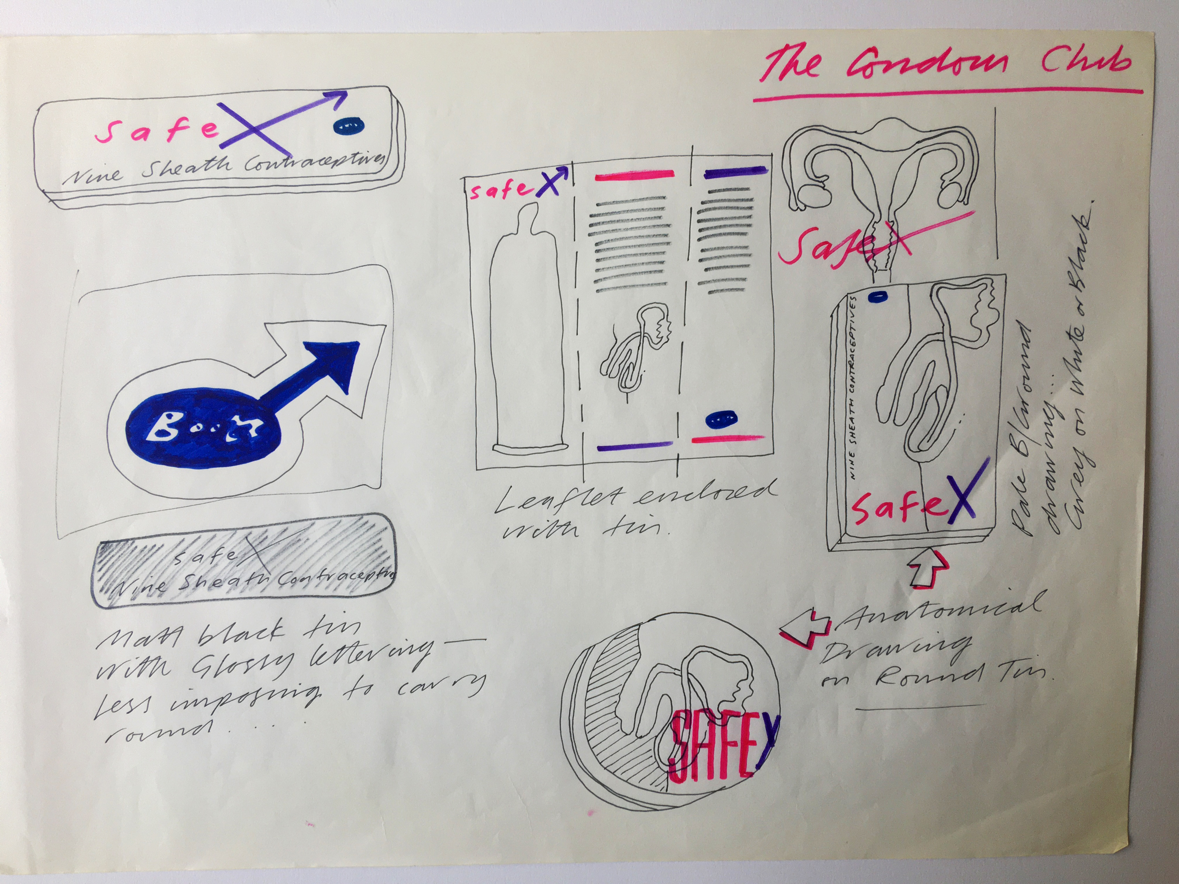
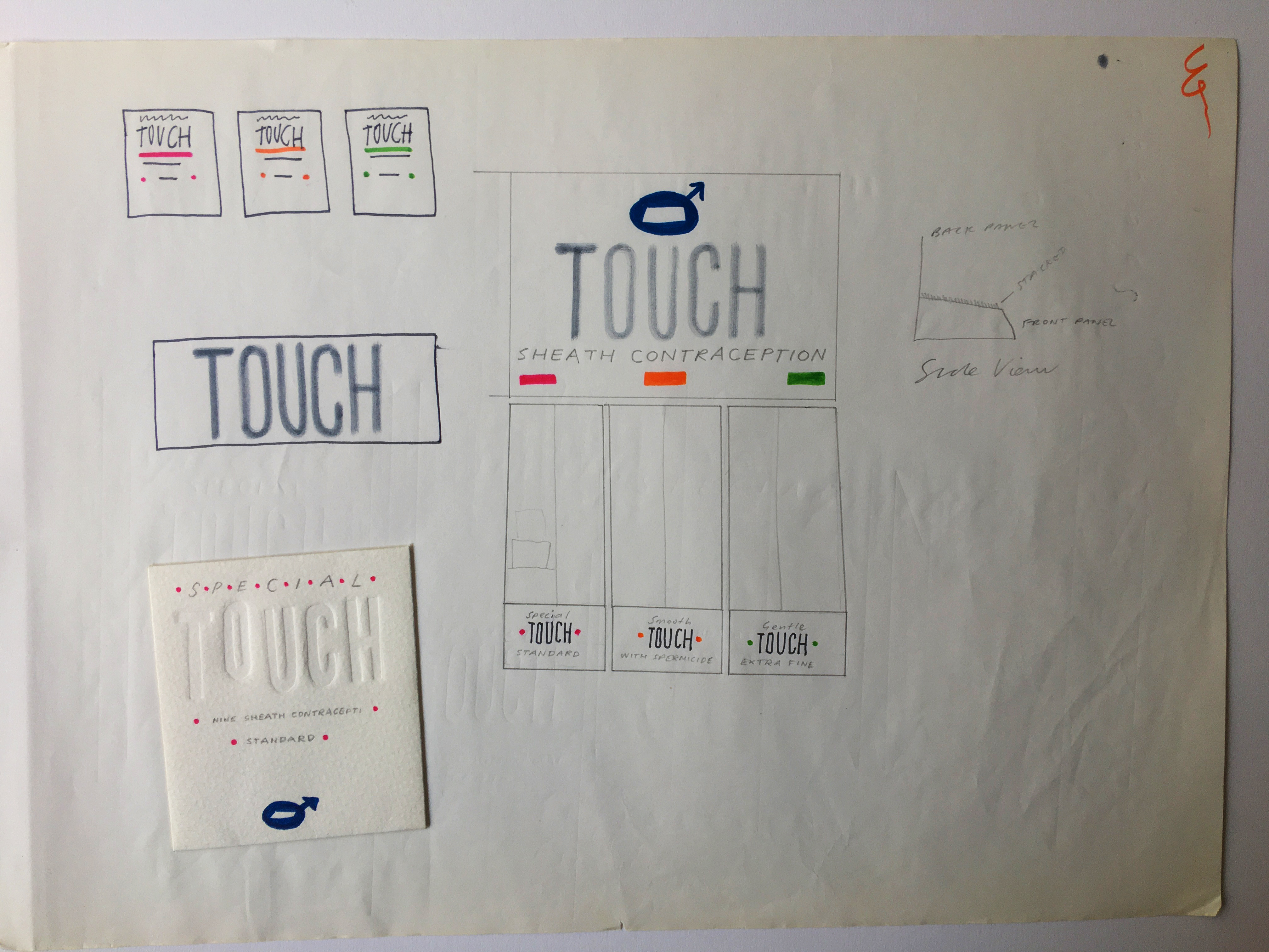
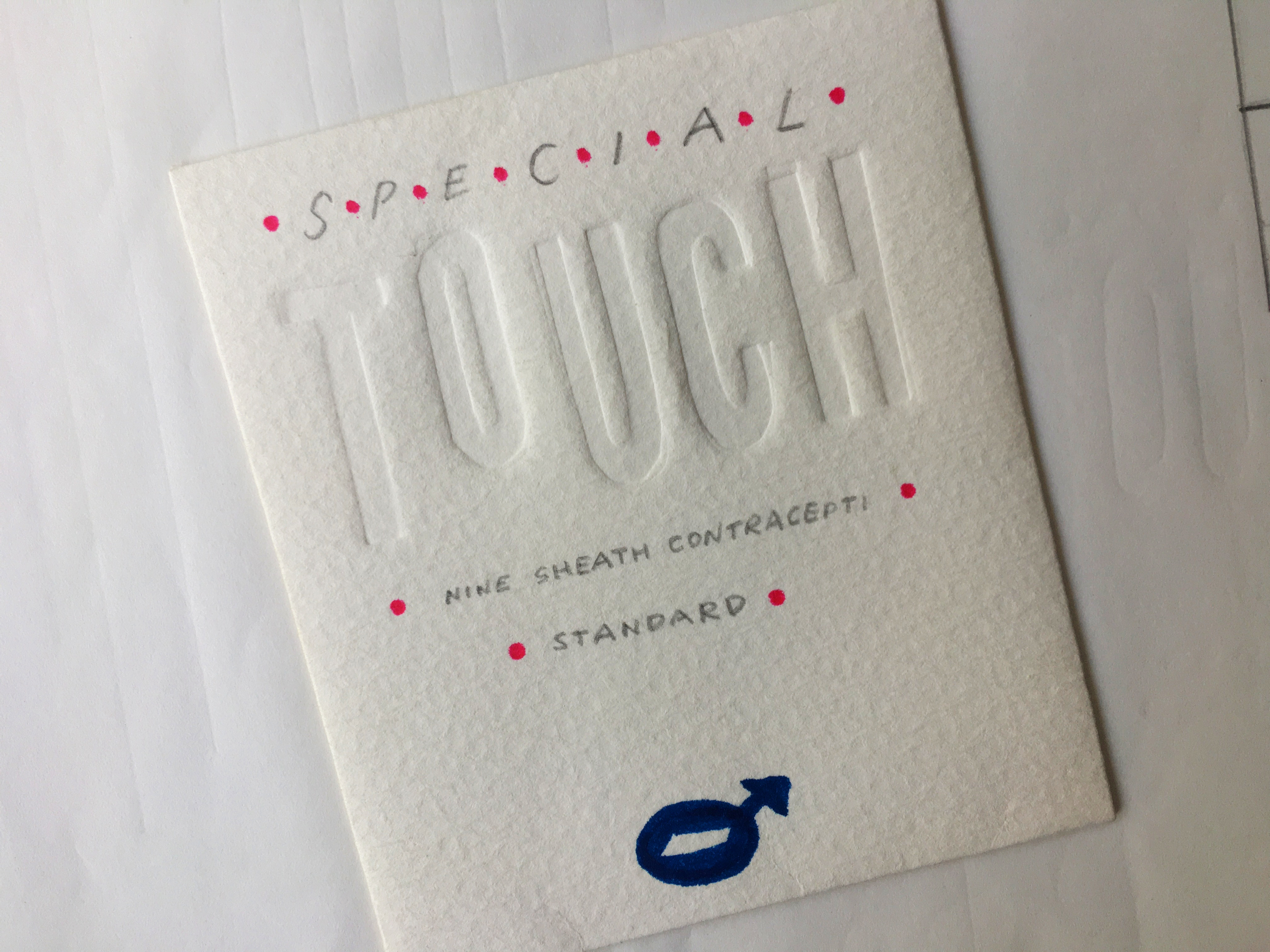
BOOTS CONDOMS
An interesting aspect to this project is that it was covered by then Creative Review journalist Matthew Gwyther for a major ‘student design’ feature in the magazine. Renowned designer Howard Milton, founder of London agency Smith & Milton, was also involved as visiting lecturer, ‘client’ and mentor.
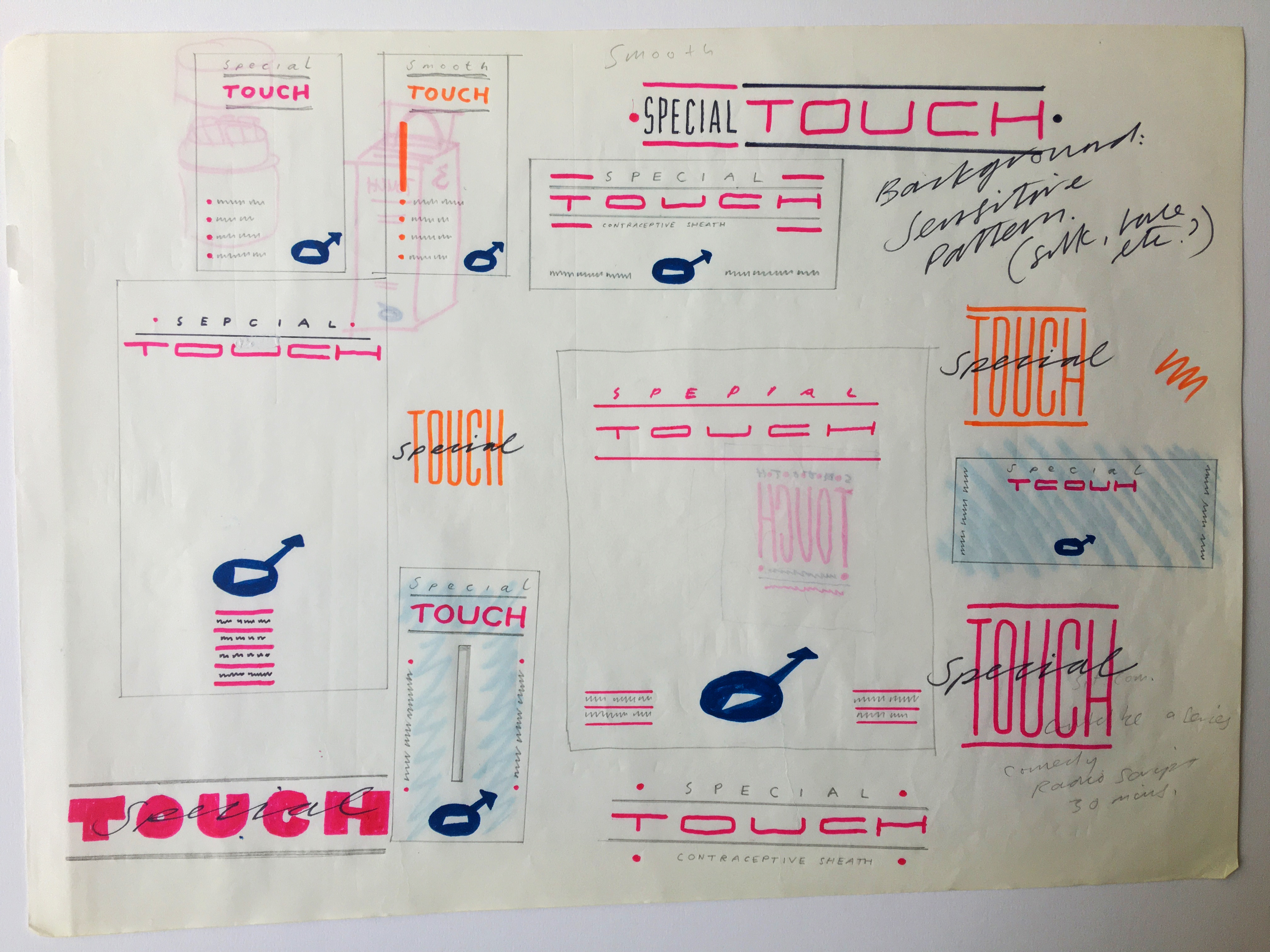
I worked on this with two of my college friends, advertising students Paul Lewis and Simon Riley, who created press ads while I looked after the packaging design and identity, although we always made sure we bounced our ideas off each other.

Initially, things didn’t go so well. At the first ideas presentation, our work was highly criticised. We were accused of being too graphically intense and not sensitive enough (although they did love my adaption of the Boots logo into the male gender symbol). We took their advice, and I tried to ensure my final package design was more subtle and tactile, using handmade card and understated embossed typography.
In his eventual Creative Review piece, Matthew Gwyther focussed on the negatives which we felt was a bit unfair. Our egos bruised, we fired off a letter expressing our unhappiness which was, funnily enough, also published. Howard Milton gave me my first real job as a ‘proper’ Designer when I graduated in July 1987. I stayed at his agency for a year before moving on.
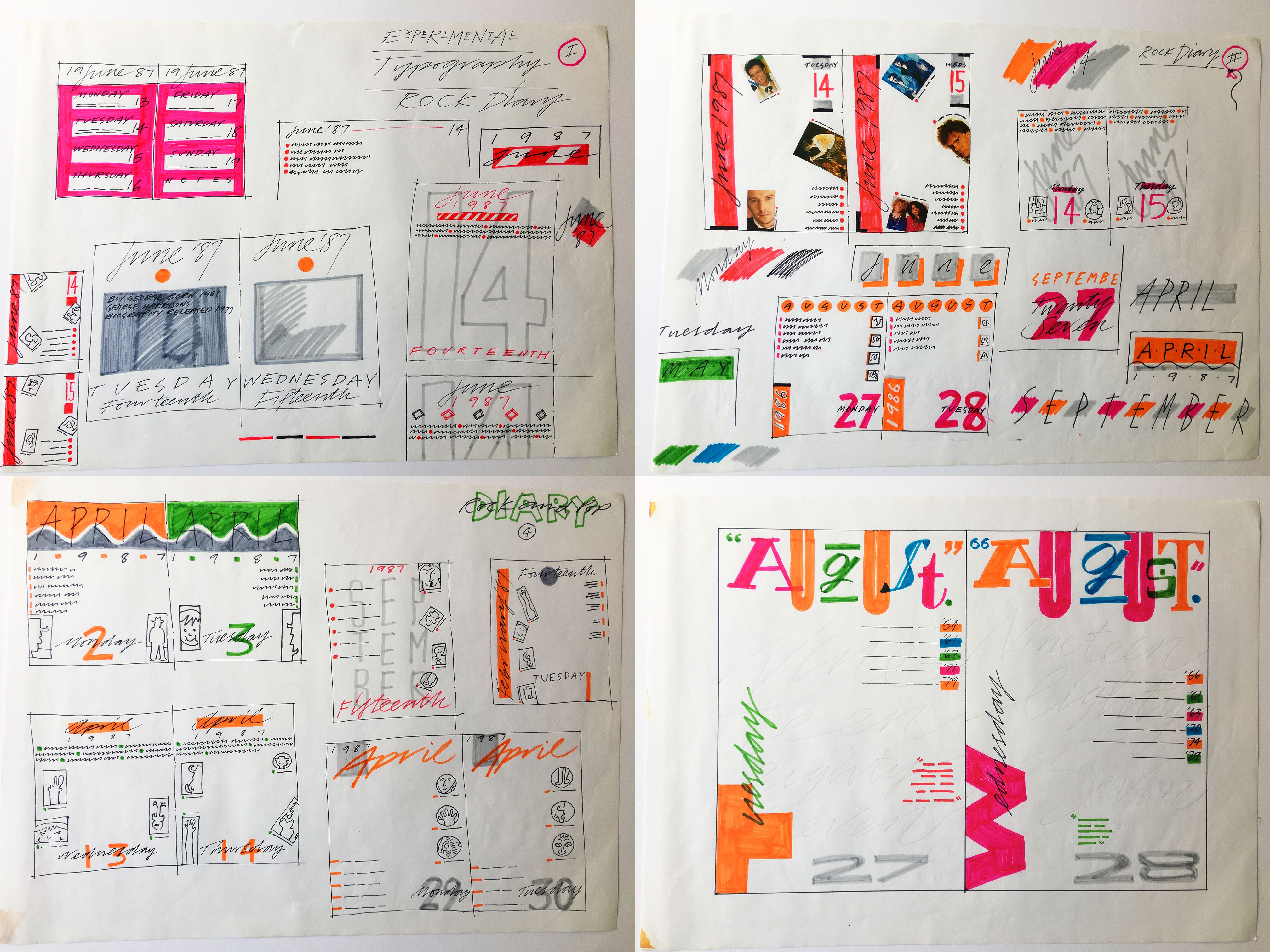
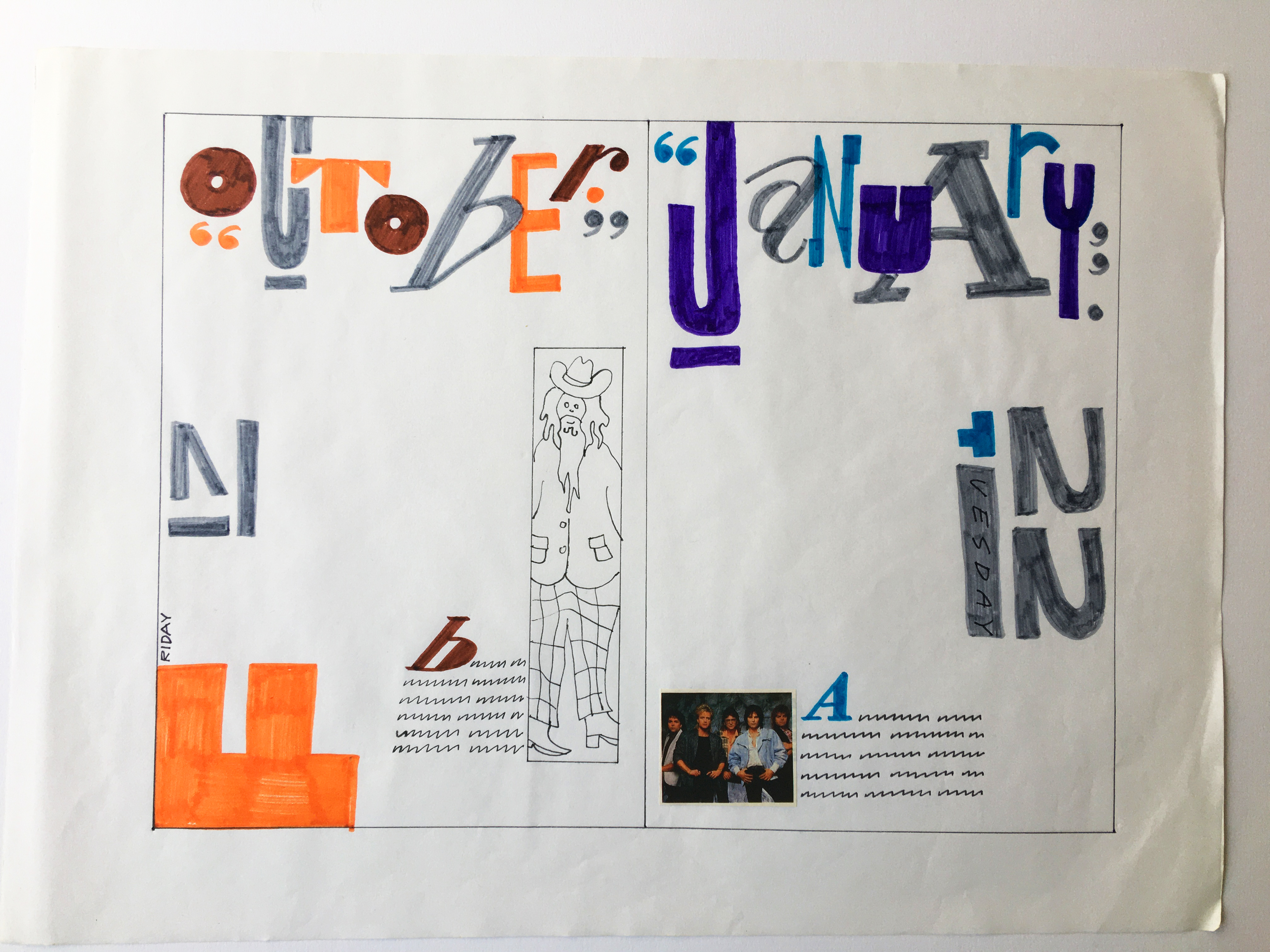
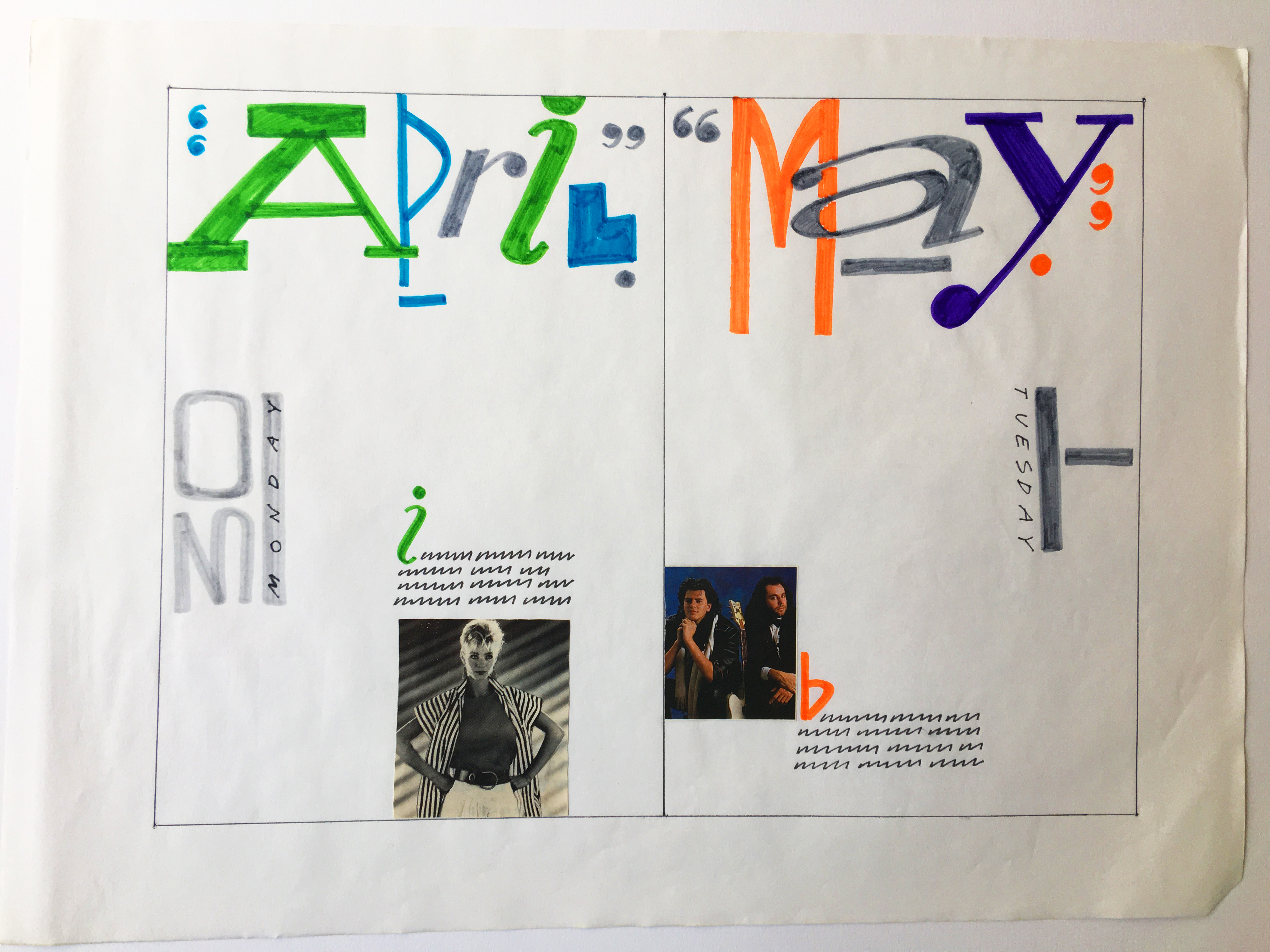
MUSIC DIARY
A second year project which the lecturer originally called ‘The NME Rock Diary’. I went for a day-to-page idea with chaotic typography vaguely influenced by Jamie Reid’s work for the Sex Pistols. The idea was that there would be a different music fact related to that particular day on each page. I felt that NME readers wouldn’t be too bothered by not having orderly straight lines to write on.
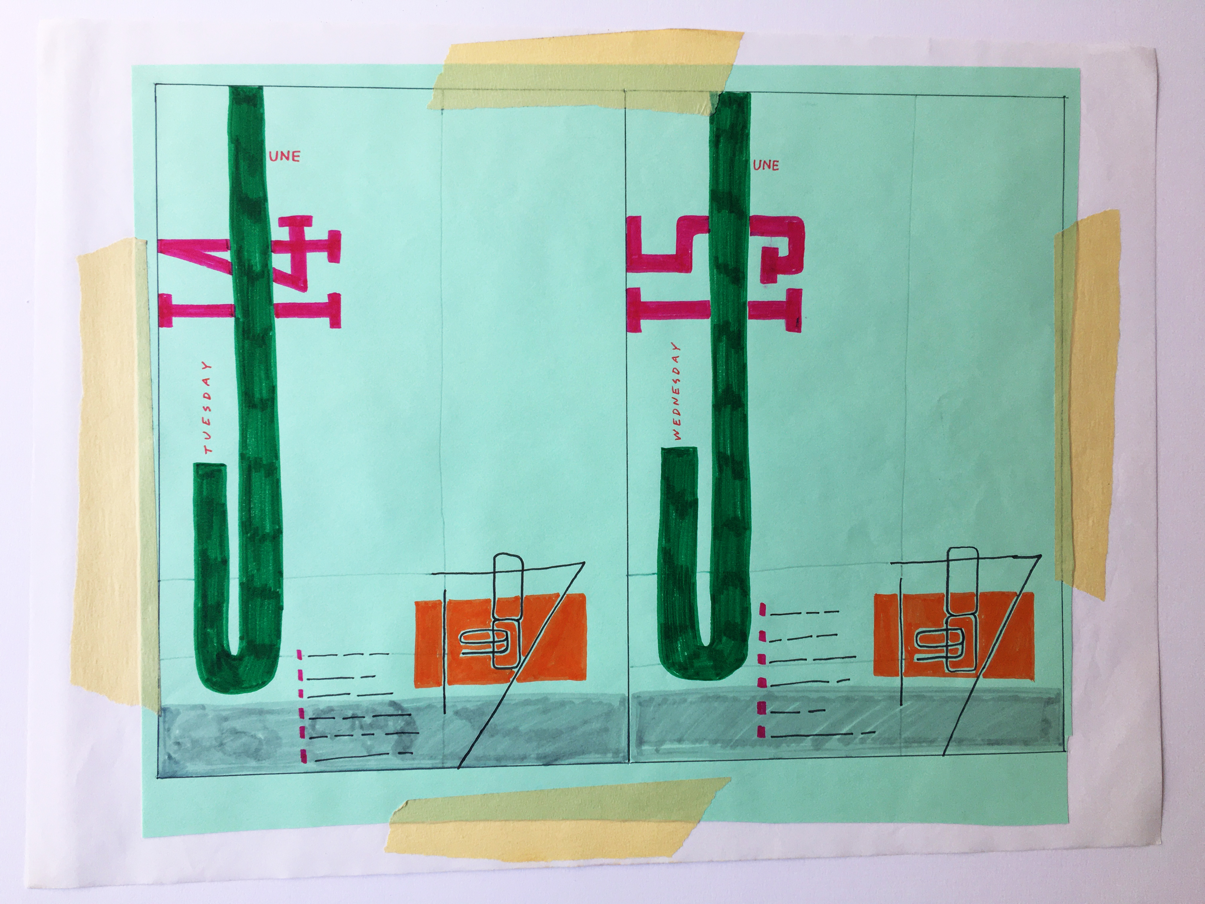
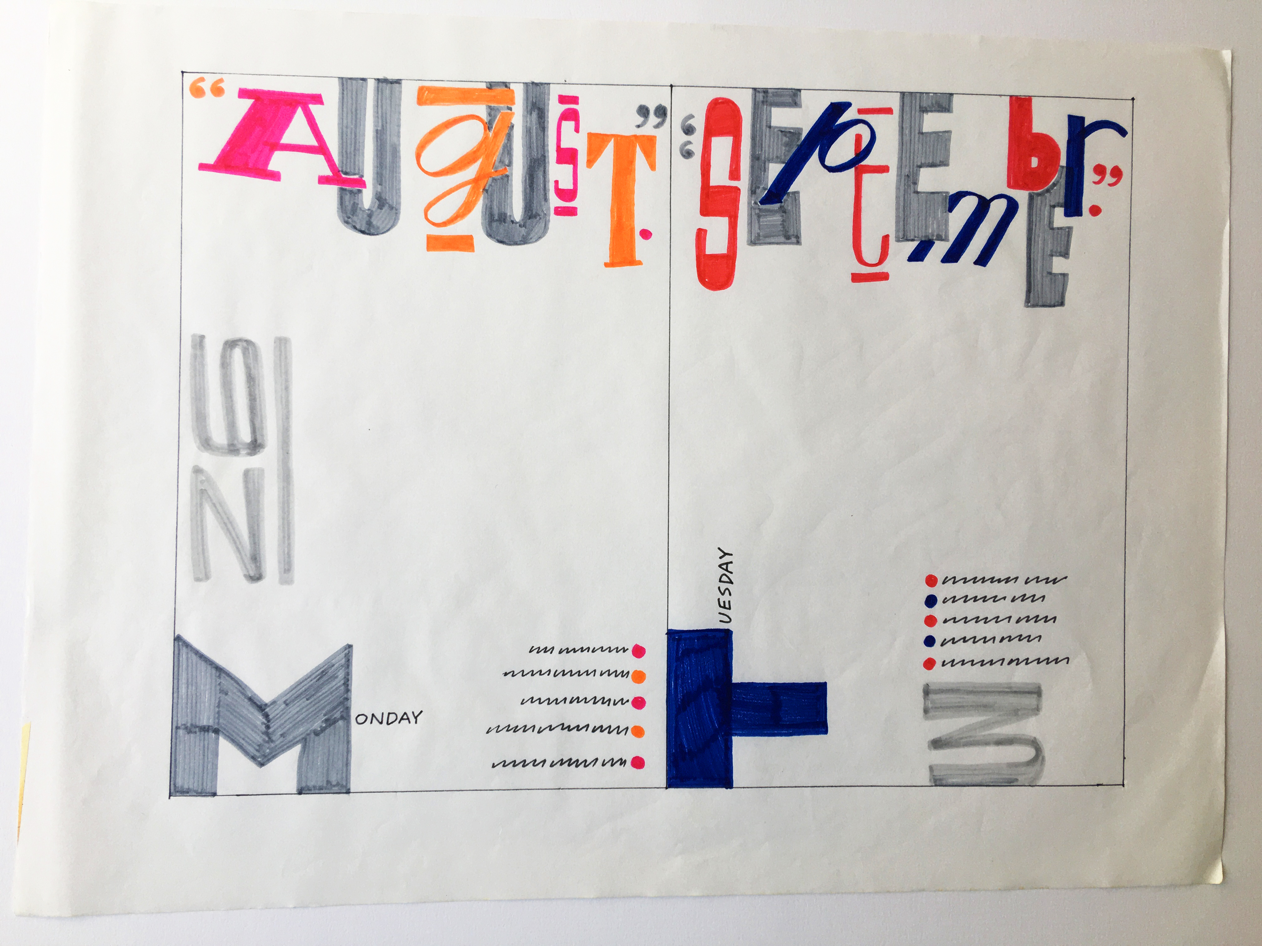
For the final presentation, I recall sitting up all night creating mock ups by arduously cutting out letters one by one using different coloured paper. Something that would now be done in minutes in Adobe Illustrator.
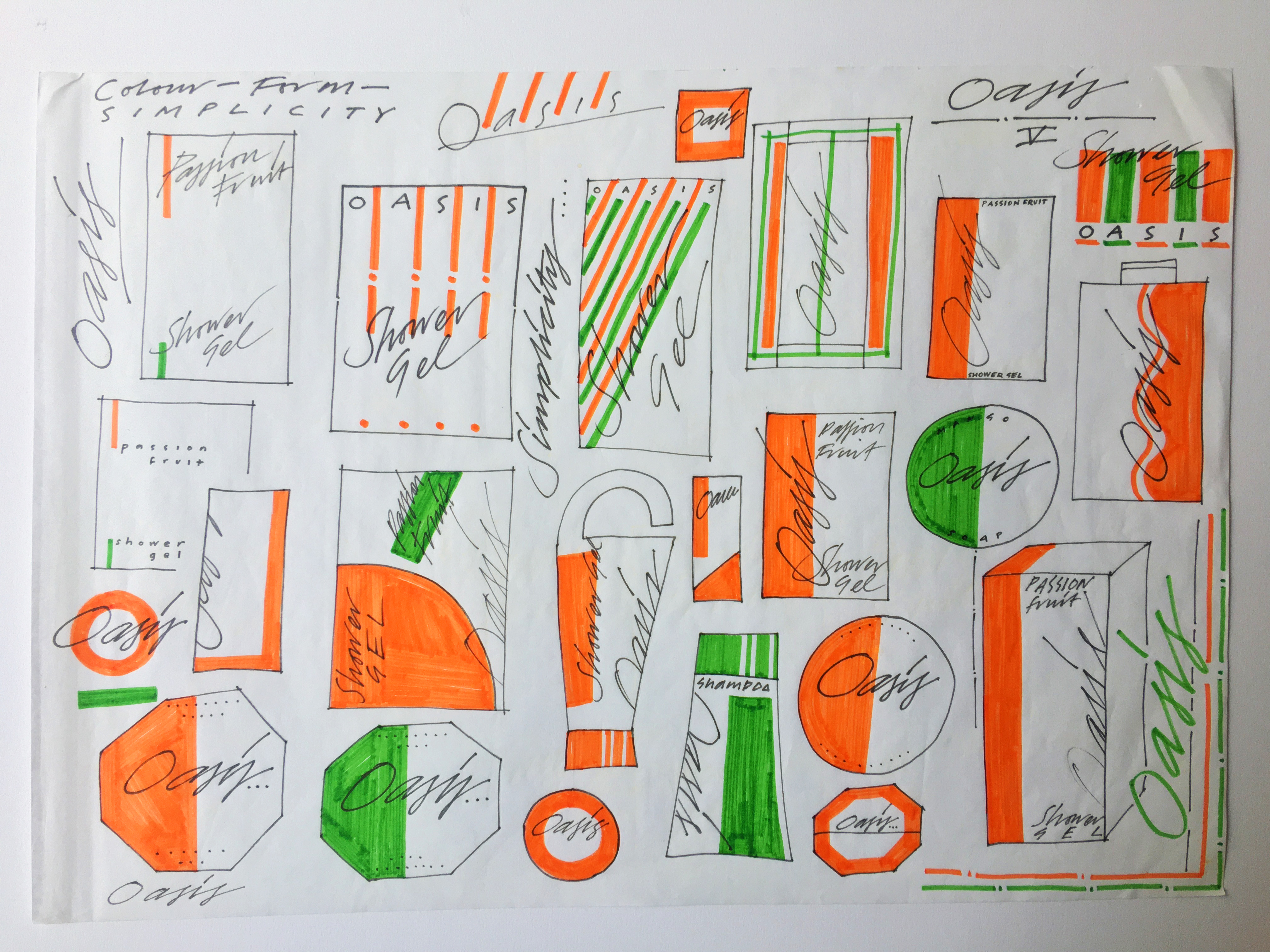
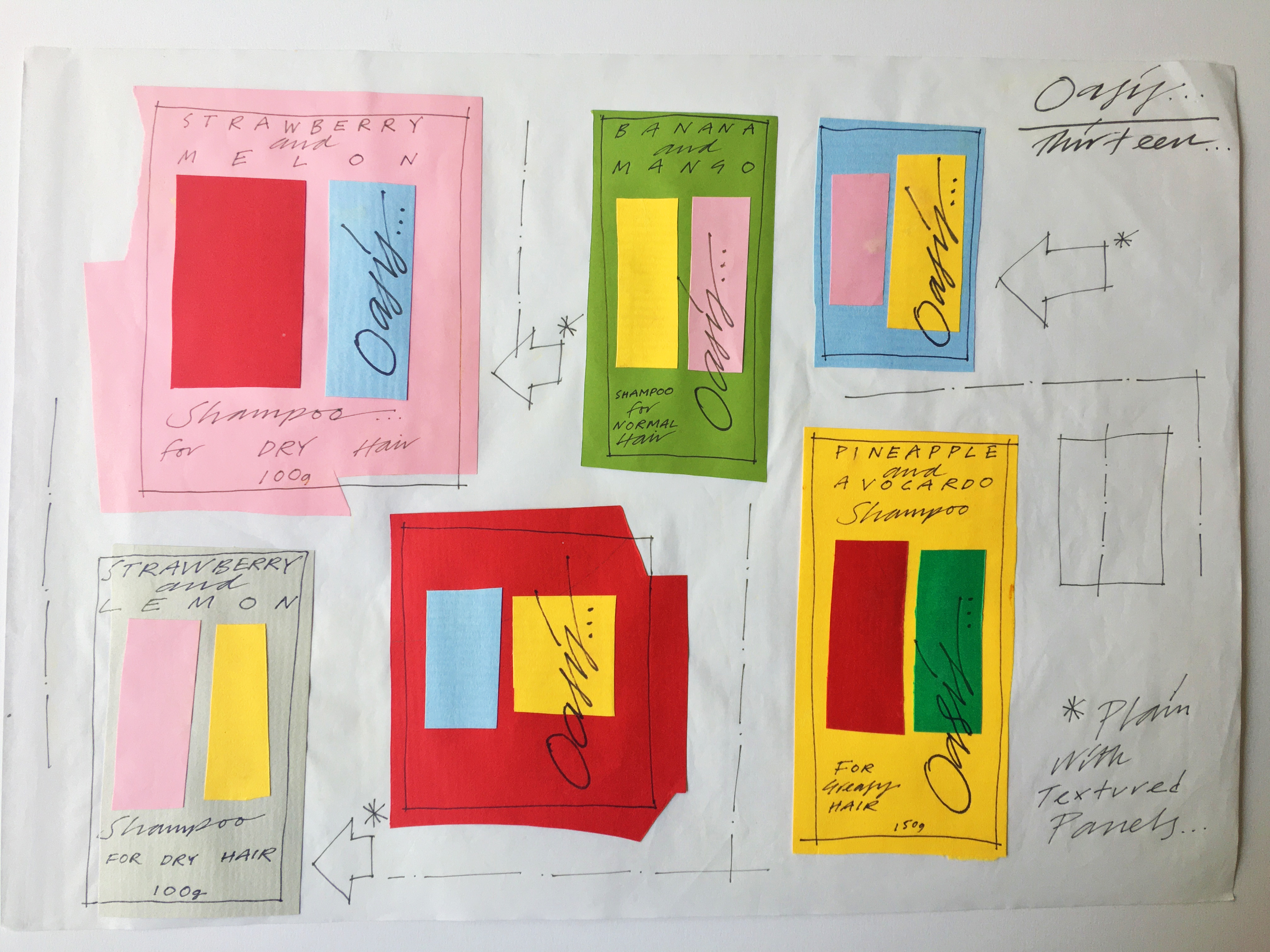
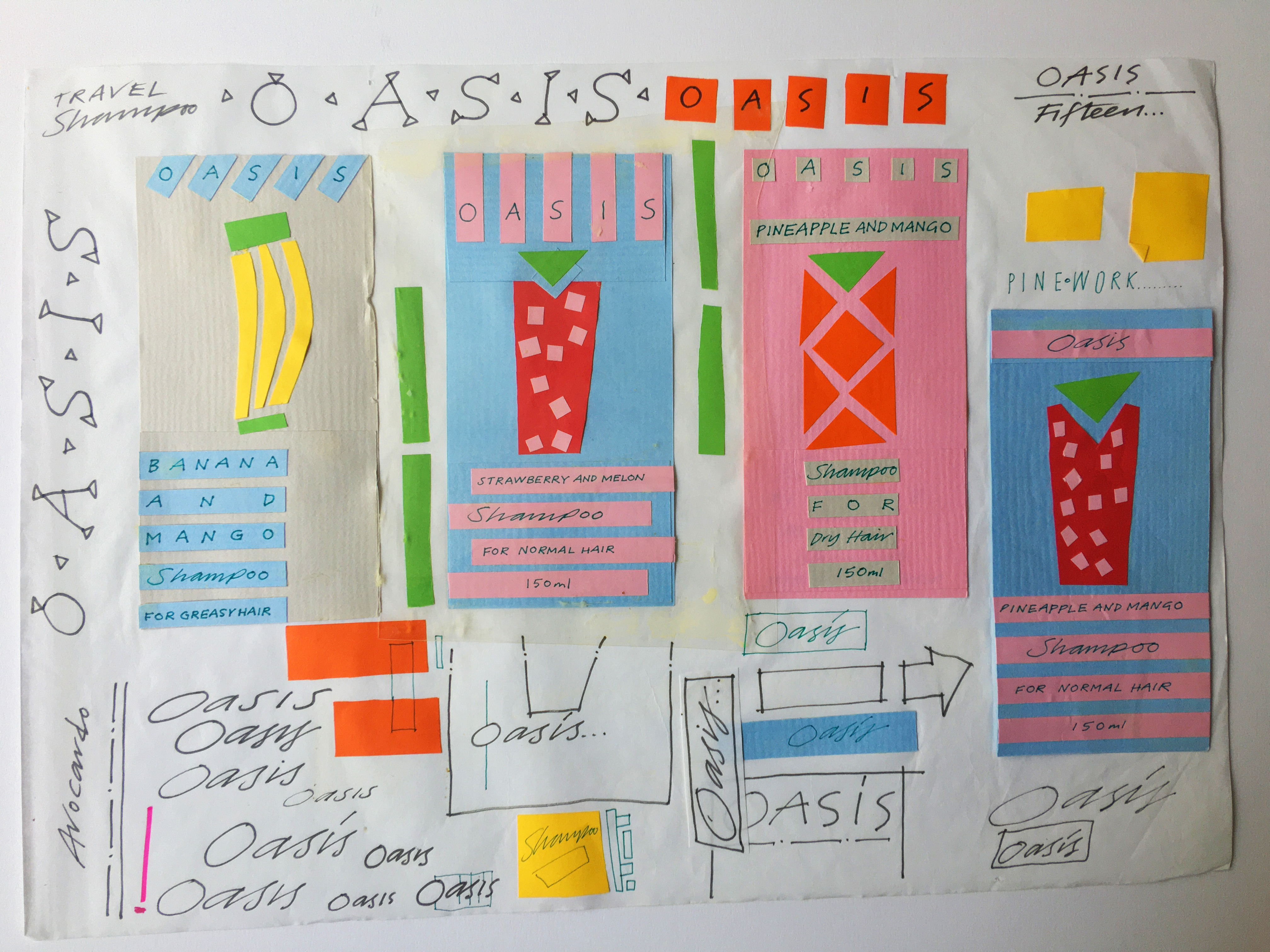
OASIS TOILETRIES
This was a ’real’ project. The college were in partnership with a company called Oasis, whose brief required designs for a range of own brand toiletries to rival The Body Shop. The chosen student would win a placement at Oasis’ head office to see their work put into production.

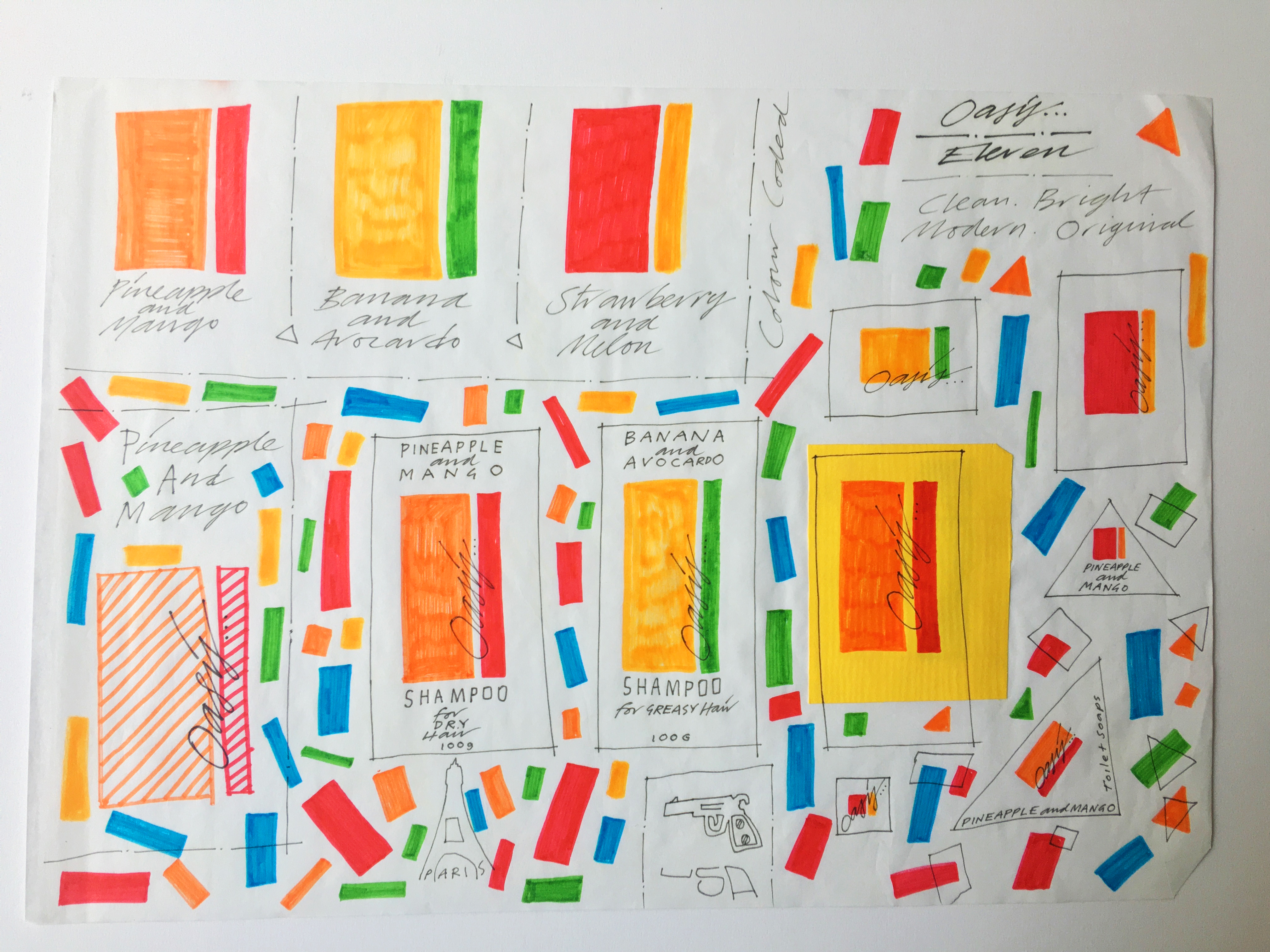
My creative plan was to play around with abstract colour representations of fruit. I was quite keen on this route until my year tutor expressed indifference, informing me that she felt the work was “a bit too Waitrose”. I had no idea what she meant at the time but I eventually developed a more illustrative approach.
I had learned a few handy presentation tricks during my summer job at DDA, and as a result my final pitch was quite well received. Alas, not well enough to win the commission.

Great post mate. Unfortunatly I can’t comment any more as I severed my tie with facebook. If you’re at all interested my comment went thusly…
Fabulous post! I was no art student but remember fondly the days when ‘cut and paste’ meant just that. I used to cut up my photographs and reshoot them onto new photos. Early use of ‘layers’ I guess. I would even go round the edge with black pen so the cut white wouldn’t stand out.’
Cheers Phil! Yes, Think I remember some of those! X
Hello, i’m sorry to bother you. I was searching online for information about the “perfect” size for a Sketchbook and I came across this Blog. Could you tell me the dimensions of these sketchbooks? Thank you
Hi Guido, These are A3 layout pads. I made these in the 1980s but you can still get them from good craft shops. All best.